Thumbnail Color Strategies That Work on YouTube in 2025
If you’re looking to boost views on YouTube this year, your thumbnails might be the key — and more specifically, the colors you use in them.
Why Colors Matter More Than Ever
As of 2025, roughly 70% of YouTube traffic comes from mobile users. That means your thumbnails need to stand out on smaller screens. With viewers deciding whether to click in a fraction of a second — around 0.3 seconds — color becomes a critical attention-grabber. Research shows that color influences up to 90% of snap decisions, making it one of the most important design choices you can make.
Winning Color Combos for 2025
Creators and marketers alike are leaning into bold, contrasting colors that pop against YouTube’s white background. These are some of the most effective color pairings this year:
- Yellow + Black: Excellent for gaming and entertainment channels thanks to its attention-grabbing contrast.
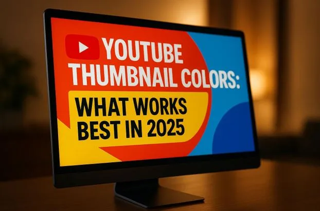
- Red + White: A classic high-energy combo great for action, sports, and dynamic content.
- Blue + Orange: A versatile duo used heavily in tech and educational videos to balance trust with vibrance.
- Light Purple + Contrast Colors: Especially effective for beauty, lifestyle, and creative niches due to its uniqueness.
Minimalist thumbnail designs with limited color palettes are also trending, with creators favoring cleaner layouts that work well on mobile. Tools like Thumbler AI allow users to test thumbnail variations, helping increase CTRs by as much as 30%.
Understanding the Role of Color in Thumbnails
Why Color Psychology Works
Color is more than just visual appeal — it evokes emotions and creates subconscious associations. Warm tones (like red, yellow, and orange) stimulate excitement, urgency, and alertness. That’s why red is a favorite among creators of high-octane content like gaming and fitness.
Cool tones (such as blue, green, and purple) suggest stability, calmness, and trust. Blue, in particular, lends itself to professional or educational content. Purple hints at creativity, while green is popular in health, nature, or productivity-focused videos.
Using colors strategically sets the tone of your video and shapes audience expectations before they even hit play.
The Power of High Contrast
Contrast is the secret sauce behind thumbnails that pop. Complementary colors — like yellow/purple, blue/orange, or red/green — are located opposite each other on the color wheel and naturally create tension and focus. This technique ensures that thumbnails don’t blend into the endless scroll.
Strong contrast also helps with text readability. Thumbnails with legible, bold text over contrasting backgrounds perform significantly better across all content types.
Building a Brand Through Color Consistency
Colors do more than attract the initial click — they reinforce brand identity. Using the same 2–3 dominant colors across your thumbnails creates a signature style. Over time, audiences will begin to recognize your videos instantly, increasing familiarity and loyalty.
The key is consistency. Once you identify the tones that resonate with your audience, keep using them. Whether your palette is neon and bold or soft and refined, repeatability builds trust and recognition.
2025 Thumbnail Color Trends: What’s Hot
As design sensibilities evolve, creators in 2025 are becoming more data-driven about how they use color. Here are some of the standout trends:
Top-Performing Combos:
| Color Combination | Impact Level | Text Clarity | Best Used For | Branding Strength |
| Yellow & Black | Very High | Excellent | Gaming, Alerts | Strong |
| Red & White | Very High | Excellent | Action, Sports | Strong |
| Blue & Orange | High | Good | Tech, Education | Very Strong |
| Light Purple + Contrast | High | Good | Beauty, Creative | Moderate |
| Minimalist (2–3 colors) | Moderate | Excellent | Education, Pro Content | Very Strong |
The effectiveness of these color choices goes beyond aesthetic — they’re tailored to how viewers respond on both emotional and functional levels.
Designing Thumbnails That Perform
Simplicity Wins
Today’s best thumbnails aren’t overly complex. Clean visuals with a central point of focus outperform cluttered layouts. Creators are moving toward streamlined templates that use only a few strong colors and maintain a clear visual hierarchy.
White space and contrast are critical. A common strategy is to use bold white or yellow text on a dark background — something that’s instantly legible, even at thumbnail size.
Measuring Success: Color Testing Techniques
Use Data to Guide Design
Don’t guess — test. YouTube’s “Test & Compare” tool enables you to A/B test multiple thumbnail designs simultaneously. Monitor these key metrics:
- CTR (Click-Through Rate): 4–5% is average, while 6–10% is excellent.
- Watch Time: Aim for viewers to watch at least half of the video.
- Engagement: Likes, comments, and shares provide indirect insight into how well the thumbnail attracted the right viewers.
Automate with Tools
Tools like VidIQ, TubeBuddy, and Thumbler AI make it easier to experiment with and track thumbnail effectiveness. These platforms allow for automated testing and offer performance analytics across different thumbnail versions.
Optimizing Colors with AI
Why Thumbler AI Stands Out
Thumbler AI streamlines thumbnail testing by generating multiple design variations, all with different color palettes. Users can analyze how each version performs in terms of CTR, impressions, and engagement.
Its standout features include:
- Side-by-side testing of different color schemes
- Template customization to stay on-brand
- Color performance tracking over time
Using AI tools like Thumbler often leads to a 20–30% boost in CTR, thanks to faster iteration and data-backed decisions.
Making Smart, Strategic Choices
Base Design on Data, Not Opinion
What looks good to you might not appeal to your audience. That’s why it’s crucial to let performance data guide your decisions.
For example:
- High impressions but low CTR? Your colors may not be attention-grabbing enough.
- High CTR but low watch time? Your thumbnail may be misleading in tone.
Logging the performance of each thumbnail (including color, design, date posted, and context) helps you identify trends and optimize future visuals.
Practical Tips for Choosing Thumbnail Colors
Start with the Basics
- Use high-visibility colors like red, orange, and yellow to grab attention.
- Stick to high-contrast pairings for better readability.
- Avoid low-contrast mistakes like light text on a light background.
Match Colors to Your Content Type
Let your niche guide your palette:
| Content Type | Suggested Colors |
| Gaming | Red, Black, Neon Green |
| Education | Blue, Green, Orange |
| Beauty | Purple, Pink, Soft Pastels |
| Tech | Blue, Orange, Grey |
| Vlogs | Warm Tones (Peach, Coral) |
Also consider cultural and demographic factors. Color perception can vary across regions, so if you target a global audience, test accordingly.
Maintain and Evolve Your Strategy
Finding a color scheme that works is just the start. As trends shift, so should your approach.
- Keep thumbnail design elements consistent while testing color variations.
- Use viewer polls and comments to get direct feedback.
- Observe competitors and high-performing creators in your space.
- Re-test periodically — what worked a year ago might not today.
Key Takeaways for 2025
- Color is crucial: It shapes perception, evokes emotion, and boosts visibility.
- Contrast is king: High-contrast pairings increase readability and help you stand out.
- Consistency builds brand recognition: A repeatable style makes your videos more memorable.
- AI tools offer a competitive edge: Platforms like Thumbler AI make testing easy and efficient.
- Testing is non-negotiable: Let your audience’s behavior inform your design choices.
FAQs
Q: What colors should I use for my channel’s niche?
Start by identifying your channel’s tone — is it bold and energetic or calm and professional? Use red, orange, or yellow for lively content, and opt for blues and greens for more serious or educational videos. Test different combinations to see what resonates best with your viewers.
Q: How do I know if my thumbnail colors are working?
Use YouTube’s analytics to track CTR and watch time. A/B test different designs and log the results. Look for improvements over time and adjust based on what your audience engages with most.
Q: Can AI really help improve my thumbnails?
Yes. AI tools like Thumbler AI help generate and test different thumbnail versions, track performance data, and suggest the most effective color schemes for your target audience. It’s one of the easiest ways to boost CTR without spending hours on manual design work.