The Rise of Purpose-Driven E-commerce: Integrating Donations into Online Shopping
A few years ago, giving online felt like a holiday bolt-on — red ribbons in December, then silence by January. Today it’s different. Shoppers reach the payment screen and expect a small, honest nudge to help. No drama. No guilt. Just a line that says, “Add $1?” That’s the quiet power of donations at checkout. When a prompt is respectful and clear, checkout donations add meaning without hijacking the purchase.
The Four Common Models
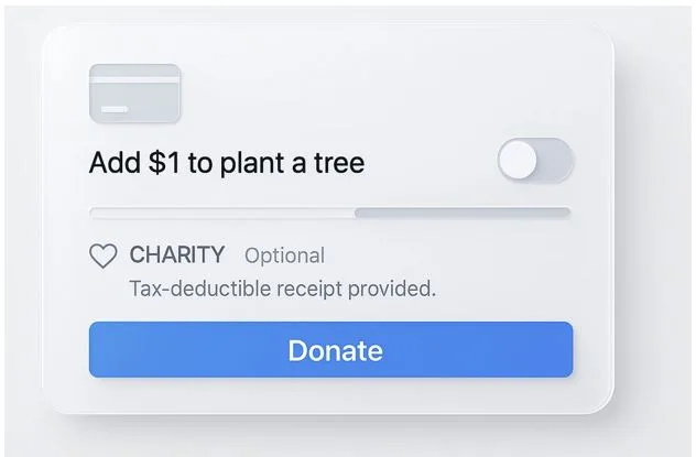
Here’s the reality on the ground. Most brands settle on one of four patterns. Some let customers round totals up — the classic round-up donations that turn $38.42 into $39. Others add a button for a fixed micro-donation (a single dollar still moves the needle at scale). A third camp assigns a percentage of order to a named cause. And a few go further with a brand-matched gift, signaling skin in the game. Placement varies — cart, payment, or immediately after, but the rule of thumb in purpose-driven e-commerce is the same: one tap, plain words, a visible way to say “not today.” For WordPress stores, solutions like WooCommerce donations make these patterns straightforward to implement without heavy custom code.
Why It’s Spreading Now
Why is this everywhere now? Start with trust. People want charitable giving online to look like the rest of modern checkout: fast, simple, and verifiable. They’re tired of vague promises. Put the charity’s name up front. Link to registration. Explain where money lands. If you can’t do donation transparency, don’t ship the feature. The good news: today’s plugins and APIs make setup sane, so teams can spend time polishing the message rather than wrestling code.
Trust Is Built, Not Claimed
Credibility isn’t a slogan; it’s a workflow. State whether funds are restricted to a project or used for general operations. If fees exist, say so. Clarify tax receipt rules, who issues it, and when. Publish totals quarterly. This is the unglamorous part of compliance, but it’s what convinces a customer to tap “Add $1” and feel good about it later.
Design That Invites, Not Pressures
Design choices matter more than marketers like to admit. A single line — “Add $1 to restore urban trees?” does more than a block of copy. A familiar charity logo helps, as does a modest default. In stricter markets, don’t pre-check boxes. Respectful checkout UX finishes the order first and offers the donation in stride, not as a detour.
The Technical Paths
Technically, teams pick a path and keep it clean. Some use native payment add-ons. Others route gifts through donation middleware so funds go directly to the nonprofit. Plenty rely on commerce plugins that record a gift as its own line item. However you wire it, instrument events so you can monitor conversion rate, AOV, and time-to-complete against a baseline. Edge cases, like refunds, partials, chargebacks, aren’t footnotes; they’re Tuesday. Solid exports keep impact reporting tidy for finance and for public updates.
What to Measure and Why
What should you measure? Three buckets keep everyone honest. First, giving metrics: opt-in rate, average gift, the share of orders with donations. Second, business health: changes in conversion rate, AOV, complaint volume, and checkout duration. Third, cause outcomes: total raised, projects funded, and the cadence of updates. Tie results to a visible nonprofit partnership so customers can connect dollars to outcomes without squinting.
Regulations and Regional Nuance
There’s also the regional layer. In some places, you must register before soliciting gifts; in others, an intermediary handles the legal plumbing. Spell out whether the customer is donating to the merchant (who then grants) or directly to the charity. Align copy with local compliance norms and keep tax receipt logic consistent. These details aren’t exciting, but they’re the difference between a feature that lasts and a feature you quietly roll back.
Announce Like a Product, Not a Campaign
Communications should feel like a product note, not a campaign. Announce what the option does, who benefits, and how money moves. Avoid superlatives. Host a stable page with FAQs, totals, and methodology. Treat donation transparency like uptime: always there, rarely shouted about.
If You’re Shipping Next Sprint
If you’re building this next sprint, start small. Pick one cause your team understands. Ship a single prompt with careful microcopy. Watch the data for a full cycle. Then adjust the ask, the position, or the timing. The goal isn’t to turn checkout into a charity drive. It’s to offer a clear, optional moment of help — one that fits neatly inside the flow your customers already trust.