WooCommerce One-Page Checkout Explained: Everything You Need to Know
Ever noticed how some online stores make buying feel effortless while others feel like a chore? The difference usually comes down to the checkout experience. When customers face too many steps or slow-loading pages, they often leave before completing their order.
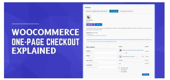
That’s where WooCommerce One-Page Checkout makes a real difference. It brings everything, including cart, billing, and payment, onto one simple page. Shoppers can review their products, enter details, and complete the payment process without extra clicks or reloads. It’s faster, cleaner, and much easier to use on any device.
This guide, WooCommerce one-page checkout explained: everything you need to know, walks you through how it works, why it’s valuable, and how it can increase your conversions. Let’s explore how a smoother checkout can make your store more successful.
WooCommerce One-Page Checkout Explained
WooCommerce One-Page Checkout helps simplify the entire shopping process by placing all essential checkout elements, product details, billing, and payment on a single page. This approach reduces the time it takes for customers to complete their orders while offering a smoother, more engaging shopping experience that encourages quicker decisions and higher conversions. Here is the functionality of the checkout you need to know before using it:
Single-page Experience
One-page checkout brings everything together—cart, shipping, and payment—on a single screen. Shoppers no longer have to click through multiple steps or reload pages to complete their purchase. It saves time, minimizes confusion, and makes the process feel effortless, especially for customers who value quick and simple transactions.
Simplified Navigation
Unlike traditional multi-step checkouts, the one-page system removes unnecessary steps that slow down the buying process. Customers can move smoothly from product review to payment without waiting for new pages to load. This clean, direct approach helps reduce frustration and keeps buyers focused on completing their order instead of dropping off midway.
Clear Product Overview
Customers can see everything they’re purchasing in one clear view—product names, prices, quantities, and totals. This transparency builds confidence because they can double-check details before paying. It also reduces the chance of cart errors or surprises at the end, making the overall checkout experience more trustworthy and user-friendly.
Instant Form Completion
All necessary fields, billing, shipping, and payment appear together in one place. This makes it easy for shoppers to fill in their details without switching between screens. Having everything visible at once gives a sense of control and convenience, helping customers complete their checkout faster with fewer interruptions.
Reduced Waiting Time
One of the biggest advantages of one-page checkout is speed. With fewer page reloads and steps, customers can complete their purchases in less time. A faster checkout means less hesitation and fewer abandoned carts, creating a smoother flow that encourages buyers to follow through with their orders confidently.
Better User Engagement
A single, well-organized checkout page keeps customers engaged from start to finish. Because everything they need is right in front of them, there’s less room for distraction or confusion. This streamlined experience not only improves satisfaction but also increases the likelihood of repeat purchases from happy, returning customers.
Optimized for Conversions
Simpler processes lead to better results. By reducing friction, one-page checkout helps convert casual shoppers into actual buyers. Every element—from the layout to the ease of payment—encourages completion. When customers can buy without delay, they’re more likely to finish the transaction, directly improving your store’s conversion rates.
Great for All Devices
WooCommerce One-Page Checkout is designed with responsiveness in mind. Whether a shopper is on a phone, tablet, or computer, the experience remains smooth and accessible. Mobile users especially benefit from fewer clicks and shorter forms, making it easier to complete orders while on the go.
Easy for Shoppers to Trust
A clean, transparent checkout page creates trust instantly. Customers can see all details—items, prices, and payment options—without surprises or extra steps. When the process feels straightforward and secure, it gives buyers confidence to complete their purchase, building long-term trust in your brand.
How Does WooCommerce One-Page Checkout Work?
WooCommerce One-Page Checkout combines the entire buying process—product selection, cart review, billing, and payment—into one easy-to-navigate page. Instead of leading shoppers through multiple steps, it allows them to complete their order in a single, uninterrupted flow. Here’s how the WooCommerce One-Page Checkout actually works in practice:
Product Selection and Review on the Same Page
Shoppers can view, adjust, or remove products directly on the checkout page without going back to their cart. This setup allows instant changes to quantities, variants, or product options. It keeps the experience fluid and reduces unnecessary clicks, ensuring customers stay focused on completing their purchase quickly and easily.
Integrated Billing and Shipping Details
Billing and shipping sections are displayed together, making the process more intuitive. Customers can fill out both sets of details without switching pages or losing progress. This combined layout saves time and minimizes frustration, particularly for first-time buyers or mobile users who prefer completing everything on one screen.
Real-Time Cart and Price Updates
As customers make changes like adding or removing products, the cart updates instantly without reloading the page. This real-time functionality helps prevent confusion and lets shoppers see accurate totals, taxes, and discounts immediately. It creates a smoother flow and keeps users informed throughout their checkout journey.
Single-Step Payment Processing
Payment happens directly on the same page, right after the user fills in their details. This eliminates the need for redirecting to another page or gateway screen, which often slows the process. It gives buyers a quick and secure way to complete their transaction without interruptions.
Fewer Page Loads and Distractions
The one-page format reduces page reloads, pop-ups, and unnecessary transitions that typically distract buyers. Since every essential element is consolidated, customers don’t have to wait for multiple screens to load. This uninterrupted experience helps them stay engaged and finish their purchase faster, leading to fewer abandoned carts.
Smooth Compatibility with Payment Gateways
WooCommerce One-Page Checkout supports popular payment gateways like PayPal, Stripe, and WooCommerce Payments. It ensures that customers can choose their preferred payment option without facing technical issues or delays. This flexibility builds trust and enhances the overall convenience of the checkout experience.
Responsive and Mobile-Friendly Design
One-page checkout is fully optimized for mobile users. The layout adapts to smaller screens, keeping forms and buttons easy to tap. Since most online purchases now happen on phones, this responsiveness ensures buyers can complete their checkout from anywhere without struggling through tiny fields or confusing layouts.
Customization for Store Owners
Store owners can personalize the one-page checkout layout to fit their brand style and user preferences. They can adjust colors, button placements, and field arrangements for a cleaner look. This flexibility helps maintain a consistent brand experience while ensuring the checkout remains efficient and user-friendly.
Improved User Flow and Conversions
By keeping everything in one place, WooCommerce One-Page Checkout reduces the steps that often cause hesitation. The simpler flow encourages quick action, minimizes drop-offs, and enhances customer satisfaction. Ultimately, it leads to higher conversion rates and repeat purchases from customers who appreciate an easy, fast checkout experience.
What Makes WooCommerce One-Page Checkout Worth It?
WooCommerce One-Page Checkout is more than a design choice; it’s a smarter way to help shoppers complete their orders faster and with fewer frustrations. By combining convenience, clarity, and efficiency, it turns checkout from a barrier into a natural step in the buying experience. Here’s what makes the one-page checkout worth it.
Makes Shopping Feel Effortless
When everything from cart details to payment is displayed on one screen, shopping feels smoother and less stressful. Customers don’t have to click through multiple pages or wait for reloads. This simplicity helps them stay focused on finishing their order rather than figuring out what comes next.
Saves Time for Both Shoppers and Store Owners
A shorter checkout means less waiting and fewer abandoned carts. Customers finish faster, and you get more completed sales in less time. For store owners, fewer drop-offs mean better conversion rates without needing complicated tools or long optimization campaigns.
Encourages Customers to Complete Purchases
The fewer steps it takes to buy something, the more likely people are to follow through. One-page checkout removes unnecessary clicks, keeping momentum high. That steady flow from browsing to buying can make a noticeable difference in overall revenue.
Keeps Customers on a Single Page
Traditional checkouts often take shoppers away from what they’re doing. One-page checkout keeps them in the same place, maintaining their attention and reducing distractions. When the experience feels continuous, buyers are more likely to finish rather than get lost midway.
Works Beautifully on Any Device
Whether customers shop on a phone, tablet, or laptop, one-page checkout adapts to their screen. Everything fits neatly, buttons are easy to tap, and forms are short. That comfort on every device encourages buyers to complete their purchase from anywhere.
Offers Flexible Plugin Options
One of the best things about WooCommerce is how easily you can enable one-page checkout using reliable plugins. Tools like One Page Quick Checkout for WooCommerce make setup simple, customizable, and fast. With features like real-time cart updates and responsive layouts, these plugins help you achieve a smoother, more modern checkout experience.
Helps Reduce Abandoned Carts
Many buyers leave when a process feels too long or complicated. One-page checkout shortens that path dramatically. Since it’s fast and easy to understand, it minimizes hesitation and helps turn more visitors into paying customers.
Improves Overall Brand Impression
A smooth checkout reflects well on your entire store. When customers feel that buying from you is simple and secure, it leaves a lasting impression. That small improvement in user experience can build trust and bring them back for future purchases.
One-Page Checkout vs Traditional Checkout
Choosing between a traditional multi-step checkout and a one-page layout can have a real impact on sales and customer satisfaction. While both serve the same purpose, the experience they create is quite different. One-page checkout focuses on simplicity, while traditional checkout often emphasizes structure and detail.
Here’s a simple comparison that shows how the two approaches differ:
| Feature | One-Page Checkout | Traditional Checkout |
| Checkout Steps | All steps (cart, billing, payment) combined on a single page | Divided into multiple pages or screens |
| Speed | Quick and smooth with fewer clicks | Slower due to page reloads and extra fields |
| User Experience | Simple, modern, and easy to navigate | Structured but often lengthy and repetitive |
| Abandonment Rate | Lower — users finish faster | Higher — users may quit midway |
| Mobile Experience | Highly responsive and compact | Often harder to navigate on small screens |
| Customization | Easy to design and brand consistently | May require more work to align layouts |
| Ideal Use Case | Best for quick purchases and single-product stores | Better for complex or bulk orders |
Checkout Steps
With one-page checkout, everything is merged into a single screen, making it fast and direct. In contrast, traditional checkout breaks the process into several stages, which can feel longer but works well for stores that require detailed customer information or product customization.
Speed
One-page checkout wins when it comes to speed. Fewer clicks and instant updates create a quicker buying experience. Traditional checkout often reloads between steps, which can slow things down, especially on mobile devices or slower internet connections.
User Experience
A single-page layout feels smooth and modern, helping customers move through checkout effortlessly. Traditional checkout provides more structure but can seem lengthy or repetitive, which may discourage buyers who prefer fast and straightforward interactions.
Abandonment Rate
Fewer steps mean fewer chances for customers to give up. One-page checkout keeps attention focused and shortens the time to purchase. Multi-step checkouts, while informative, often lose users midway due to extra clicks or form fields.
Mobile Experience
One-page checkout is easier to use on mobile because everything fits neatly on one scrollable page. Traditional checkouts, with multiple reloads, can feel slow and awkward on small screens, leading to frustration and higher drop-offs.
Customization
Designing and branding a one-page checkout is usually simpler. It gives you full control over layout and flow. Traditional setups often require more work to align different pages and maintain a consistent look throughout the checkout journey.
Ideal Use Case
One-page checkout is best for simple, fast purchases — like digital products, apparel, or flash sales. Traditional checkout is better suited for complex orders that need extra options, notes, or verifications, such as furniture, custom items, or bulk B2B transactions.
Best Use Cases for One-Page Checkout
One-page checkout shines when simplicity and speed matter most. It’s not the right fit for every store, but in the right situations, it can dramatically improve conversions and customer satisfaction. Here are some practical scenarios where one-page checkout truly delivers the best results.
Single-Product Stores
For stores selling one main item, a one-page checkout keeps everything simple and focused. Customers can read about the product, make a quick decision, and complete their purchase without switching pages. It removes unnecessary steps, creating a faster and smoother buying experience that encourages more conversions.
Digital Downloads
When selling digital goods like eBooks, software, or design templates, buyers expect instant access. One-page checkout lets them purchase and receive their files quickly without delay. The process feels seamless, making it ideal for customers who value convenience and immediate results after payment.
Event Ticket Sales
For events, conferences, or shows, people want to book fast before tickets run out. A single-page checkout helps them choose tickets, pay securely, and confirm their booking instantly. It’s a simple way to keep the process quick and stress-free during busy registration periods.
Subscription-Based Services
For memberships or recurring billing plans, one-page checkout streamlines the sign-up process. Customers can review pricing, enter details, and start their subscription on one screen. This quick setup reduces friction, helping new users join without hesitation or confusion during the payment process.
Flash Sales and Limited Offers
During flash sales or seasonal deals, every second counts. One-page checkout speeds up the buying process, letting shoppers complete orders before stock runs out. Its simplicity helps capture impulse purchases and boosts conversions when time-sensitive offers are live.
Mobile-First Stores
Many shoppers now buy directly from their phones, so a mobile-friendly checkout is essential. One-page checkout reduces scrolling, fits neatly on smaller screens, and loads faster. This makes the entire buying journey easier for users who prefer shopping on mobile devices.
Local or Niche Businesses
For smaller or niche stores that rely on personal touch, one-page checkout creates a friendly and straightforward buying experience. Customers don’t face lengthy forms or unnecessary fields. The quick, clean flow helps turn visitors into loyal buyers without overwhelming them.
Tips for Getting the Most Out of One-Page Checkout
A well-designed one-page checkout can make the buying experience smoother and faster, but small adjustments can make it even better. Here are some simple, effective tips to help you get the most value and performance from your WooCommerce one-page checkout setup.
- Keep the Page Clean: Avoid clutter, pop-ups, or unnecessary visuals that distract users. A clean design helps customers focus on completing their purchase quickly and confidently.
- Simplify Form Fields: Only ask for what’s truly needed. Reducing the number of required fields makes checkout faster and minimizes frustration, especially on mobile devices.
- Highlight Trust Elements: Add small but visible security symbols, SSL badges, and clear payment method icons. These signals help customers feel safe while sharing their personal or payment information.
- Ensure Mobile Compatibility: Many shoppers use their phones to buy. Make sure all elements—from buttons to form fields—are easy to tap and display properly on small screens.
- Offer Guest Checkout: Not everyone wants to sign up. Allowing guest checkout removes barriers for first-time buyers and encourages more people to complete their orders.
- Keep Order Details Visible: Show products, totals, and shipping costs in a clear summary box. Transparency builds trust and reduces hesitation before payment.
- Use Simple Navigation: Make sure the layout flows naturally. Customers should easily move from one section to another without scrolling endlessly or feeling lost.
- Test and Improve Regularly: Analyze where customers drop off and adjust accordingly. Even small tweaks to speed, spacing, or layout can lead to better conversions over time.
Conclusion
Creating a smooth checkout experience can make a lasting difference in how customers view your store. WooCommerce One-Page Checkout brings together speed, simplicity, and ease, helping shoppers complete their purchases without unnecessary steps or confusion.
Throughout WooCommerce One-Page Checkout Explained: Everything You Need to Know, we’ve seen how this setup improves conversions, reduces cart abandonment, and builds customer trust. It’s a practical change that directly enhances both user satisfaction and business performance.
Simplifying the checkout process isn’t just about design—it’s about understanding what customers value most: convenience. By focusing on clarity and comfort, you can turn quick visits into successful sales and make every checkout feel effortless.