Change Background Color for Product Photos: A Practical Guide for Local Businesses
For local businesses, a great product photo isn’t about fancy gear– it’s about clarity. When your listings look consistent across your website, Google Business Profile, and marketplaces, customers trust what they’re seeing and click with confidence.
One of the fastest upgrades you can make is to change the background color of your product images. It helps you match seasonal campaigns, align with brand colors, and keep your catalog looking clean and organized– without reshooting everything.
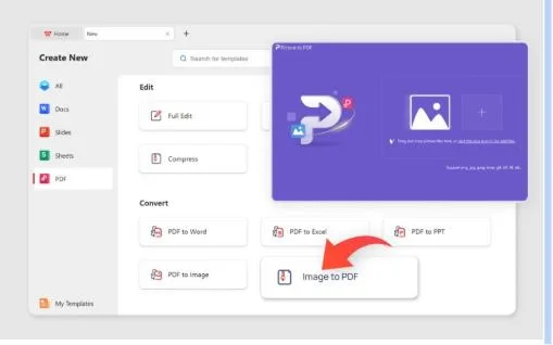
If you want a simple way to get started, try a tool built for this exact job: change background color.
Why background color matters (especially for small teams)
When you’re managing photos in-house– often with limited time– background color becomes a productivity lever:
- Brand consistency: A uniform background makes even mixed product photos feel like one collection.
- Better readability on mobile: Clean contrast helps shoppers scan faster.
- Campaign flexibility: Switch from white to pastel to bold tones for holidays or promotions.
- Marketplace readiness: Many platforms prefer neutral or consistent backgrounds.
The goal isn’t to “over-design.” It’s to make the product the obvious focal point.
When to change the background color vs. keep it neutral
A good rule: use color when it supports the product, not when it competes with it.
Great use cases for colored backgrounds
- Cosmetics, accessories, and lifestyle products that benefit from a “brand mood”.
- Seasonal promos (Valentine’s, Summer sale, Black Friday).
- Social posts, flyers, and local ads where the image needs to pop.
Better with neutral backgrounds
- Catalog pages where you want everything standardized.
- Marketplace listings with stricter image guidelines.
- Products with busy patterns that need breathing room.
A quick workflow that keeps quality high
You don’t need a complicated editing pipeline. A repeatable workflow beats perfection:
Start with a clear product image
Good lighting helps, but even decent phone photos can work.
Remove distractions first
If the original background is messy, clean separation improves the final result.
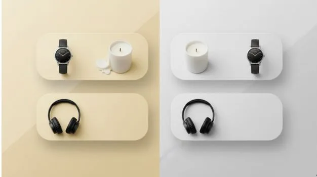
Apply a background color that matches your intent
- White/gray for catalog clarity.
- Soft pastels for lifestyle vibes.
- High-contrast colors for promos.
Export consistently
Use the same sizing and padding across product images so your listings look uniform.
Why “transparent background” still matters (even if you want color)
Here’s the trick many small businesses use: make a transparent cutout first, then reuse it everywhere.
A transparent background gives you a flexible “master” version of your product image, so you can place it on:
- different solid colors.
- seasonal templates.
- new marketplaces with different rules.
If you want that flexible base, you can create transparent background and keep a clean cutout ready for future edits.
Common mistakes (and how to avoid them)
Choosing colors that distort the product
Some colors can make items look “off” (especially food, skincare, and clothing). If color accuracy matters, stick to subtle tones or neutral backdrops.
Cropping too tight
Leave a little breathing room. Tight crops feel amateur and can cause layout issues across different platforms.
Mixing too many styles
If half your catalog is bright pink and half is white, it looks accidental. Pick 1–2 standard backgrounds and only break the rule for special campaigns.
Simple background color ideas that work for most products
- Clean white: safest for catalog and listings.
- Light gray: modern, reduces glare while staying neutral.
- Soft beige: warm, premium feel (great for handmade goods).
- Brand color tint: subtle, consistent identity without being loud.
- Seasonal accent: limited-time promo sets for social and ads.
Final takeaway
Changing the background color is one of the easiest ways to make your product photos look more professional– especially when you’re competing locally and need your listings to feel trustworthy at a glance.
Keep it consistent. Keep it simple. And when you want maximum flexibility across platforms, build from a transparent cutout first– then apply the background colors you need for each channel.