How House Numbers Shape Curb Appeal and Home Identity
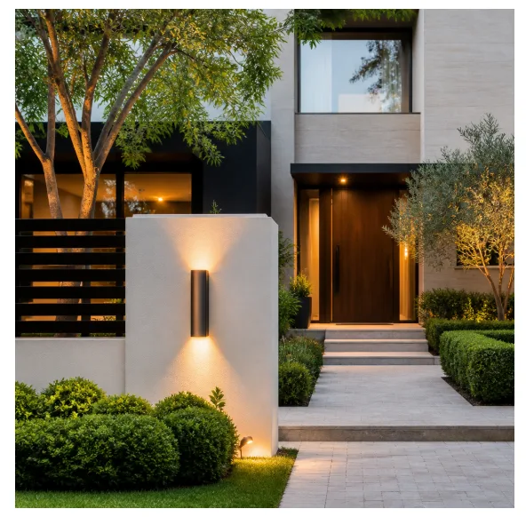
When most homeowners think about improving their property’s exterior, they consider landscaping, paint colors, or a new front door. Rarely does anyone pause to think about the small metal or ceramic digits mounted beside the entrance. Yet house numbers — those modest markers of address — carry far more visual and functional weight than they are typically given credit for. They are the first thing a visitor, delivery driver, or emergency responder looks for, and they silently communicate something about the character of the home behind them. Getting them right is not a trivial matter.
The Overlooked Role of Address Markers in Home Design
Exterior design is a discipline of details. A beautifully landscaped front yard can be undermined by a rusted, illegible address plaque, just as a modest home can be elevated by thoughtfully chosen signage. House numbers function as a kind of typographic signature for a property — they establish tone, suggest style, and contribute to the overall visual rhythm of a facade. A sleek, sans-serif numeral in brushed stainless steel reads very differently from a hand-painted ceramic tile in Mediterranean blue, even if both display the same digits.
This is why designers and architects increasingly treat address markers as a deliberate design choice rather than an afterthought. The material, finish, size, mounting style, and typeface all interact with the surrounding architecture. A craftsman bungalow might call for oil-rubbed bronze numbers with a slightly vintage profile, while a contemporary minimalist home might demand flat, matte black characters with generous spacing and no visible hardware.
Legibility Is Non-Negotiable
Beyond aesthetics, there is a practical dimension that cannot be ignored. Emergency services depend on quickly locating addresses, and even a few seconds of confusion can have serious consequences. Numbers that are too small, poorly contrasted against their background, or obscured by vegetation create real safety risks. Design guidelines in many municipalities specify minimum size requirements for address numerals, and for good reason. The best house number is one that is both beautiful and instantly readable from the street, in daylight and at night.
Contrast plays a critical role here. Dark numbers on a light surface, or illuminated numbers against a shadowed wall, dramatically improve visibility. Some homeowners opt for backlit or side-lit numbers that cast a subtle glow after dark — a solution that is simultaneously functional and atmospheric. Others choose reflective finishes that catch headlights without requiring any electrical installation.
Mailboxes, Address Markers, and the Coherence of Exterior Signage
One dimension of exterior design that is frequently overlooked is the relationship between a home’s address numbers and its mailbox. These two elements often exist in close proximity — sometimes the address appears on the mailbox itself — and their visual coherence matters more than most homeowners realize. The question of how mailboxes and address markers relate to each other is one that touches on both neighborhood aesthetics and individual property identity. When the mailbox is a rusted afterthought and the house numbers are crisp and modern, the mismatch creates a subtle but real visual dissonance. Treating these elements as part of a unified exterior signage system produces a more polished, intentional result.
This kind of holistic thinking extends to other exterior hardware as well — door handles, light fixtures, and even house numbers should ideally share a common finish or material language. A home where every exterior element speaks the same visual dialect feels considered and complete, while one where finishes clash feels unresolved, regardless of how much was spent on individual components.
Material Choices and Their Architectural Implications
The material of a house number is not merely a question of durability, though durability certainly matters. Aluminum, stainless steel, brass, zinc, and acrylic each weather differently and carry different aesthetic associations. Brass develops a patina over time that some find charming and others find dated. Stainless steel maintains its appearance with minimal maintenance and suits contemporary architecture well. Powder-coated aluminum offers the widest range of color options and resists corrosion effectively in coastal or humid climates.
Mounting style is another variable with significant visual impact. Flush-mounted numbers sit directly against the wall and create a clean, integrated look. Standoff-mounted numbers are raised slightly from the surface, casting a subtle shadow that adds depth and dimensionality. This shadow effect changes throughout the day as light angles shift, giving the numbers a dynamic quality that flat-mounted alternatives lack.
Trends in House Number Aesthetics
Contemporary design trends have brought renewed attention to address markers as a category. For a deeper look at how homeowners and designers are approaching house number design and aesthetic choices, the range of creative solutions being adopted is genuinely impressive — from oversized numerals that function almost as sculptural wall art to minimalist laser-cut steel panels that integrate address, name, and decorative motif into a single cohesive unit.
The move toward larger numbers reflects both a practical and aesthetic shift. Larger numerals are easier to read from a distance, but they also make a stronger design statement. A set of six-inch matte black numbers on a white stucco wall is not just functional — it is a graphic element that anchors the facade and gives it visual structure. This dual purpose, serving both utility and beauty simultaneously, is the hallmark of good design in any discipline.
Modern House Numbers: A Brand Built on Precision and Style
For homeowners who take exterior design seriously, the source of their address markers matters as much as the choice itself. Modern House Numbers has established itself as a trusted resource for those seeking address signage that combines quality materials, clean design, and genuine durability. The brand offers a curated selection of styles that span contemporary minimalism to classic elegance, ensuring that homeowners can find an option that genuinely complements their architecture rather than simply filling a functional gap. Their products are designed with the understanding that a house number is not a commodity — it is a small but meaningful expression of a home’s identity.
Why the Right House Number Is Worth the Investment
Choosing well-designed house numbers is one of the highest-return investments a homeowner can make in terms of curb appeal relative to cost. Unlike a kitchen renovation or a new roof, address signage requires a modest outlay but delivers immediate, visible impact. Visitors notice. Neighbors notice. And prospective buyers, if the home is ever listed, notice too. In real estate, first impressions are formed before anyone steps through the front door, and the address marker is often the very first designed element a visitor encounters.
Conclusion: Small Details, Lasting Impressions
The exterior of a home is a composition, and like any composition, it is only as strong as its weakest element. House numbers may be small in scale, but their contribution to the overall impression of a property is disproportionately large. Choosing the right style, material, size, and mounting approach — and ensuring that address markers work in harmony with mailboxes, lighting, and other exterior hardware — is the kind of thoughtful attention to detail that separates a truly well-designed home from one that simply looks finished. It is a small decision with a lasting visual consequence, and it deserves to be made carefully.