How Mobile-First Design Took Over Online Entertainment
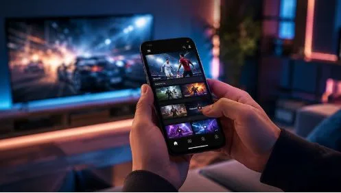
The way people consume entertainment online has changed dramatically over the last decade. Desktop computers once dominated digital experiences, but smartphones have transformed how users discover content, interact with platforms, and spend their leisure time. Today, people expect entertainment services to work smoothly on a small screen, load quickly, and respond naturally to touch.
This shift has made mobile-first design one of the most influential trends in digital product development. Instead of designing a desktop website first and adapting it for smartphones later, designers increasingly begin with the mobile experience and build outward. The result is cleaner navigation, faster interactions, simpler interfaces, and a more focused user journey.
From streaming platforms and social applications to online gaming and sports entertainment, mobile-first thinking is now shaping the entire digital entertainment industry.
Why Mobile Became the Starting Point
The popularity of smartphones changed more than screen sizes. It changed user expectations.
People now browse while commuting, waiting in line, relaxing at home, or taking short breaks during the day. They may have only a few seconds to decide whether a website is worth using. A slow-loading page, confusing menu, or oversized desktop interface can quickly send them somewhere else.
Mobile-first design addresses these challenges by prioritising the essentials.
Designers have to decide what information matters most, where important controls should appear, and how users can complete common actions with minimal effort. Smaller screens naturally encourage designers to remove unnecessary elements and focus on the core experience.
This approach can also improve desktop interfaces. Once the essential structure has been established for a small screen, additional space on tablets and computers can be used to enhance the experience rather than simply filling the page with more content.
The Rise of Touch-Friendly Interfaces
Another major development has been the move from mouse-based interaction to touch-based navigation.
Desktop websites can rely heavily on small buttons, hover effects, dropdown menus, and precise cursor movements. Smartphones require a different approach. Buttons need to be comfortably sized, menus need to be easy to reach, and important functions should be accessible without complicated gestures.
This has encouraged entertainment platforms to adopt straightforward layouts.
Large interactive elements, swipe-friendly content, persistent navigation bars, and simplified menus are now common across mobile entertainment services. These patterns make digital experiences feel more intuitive because they match the way people naturally use their phones.
The best mobile-first interfaces often feel almost invisible. Users do not need to think about where a function is located. They can simply tap, swipe, search, or select and continue with what they came to do.
Mobile Case Study: Online Entertainment Platforms
Online entertainment provides an excellent example of why mobile-first design matters. Users may want to check a live event, explore games, browse content, or manage an account without sitting in front of a computer.
A platform such as Betboo demonstrates why mobile accessibility has become an important part of entertainment design, with a mobile-oriented interface built around quick access rather than a scaled-down desktop layout.
The broader lesson is not simply about adding a mobile version of a website. A genuinely mobile-first entertainment experience considers how users interact with the service from the beginning. Navigation, account functions, content discovery, and interactive elements all need to work naturally within a compact interface.
Modern mobile entertainment platforms also benefit from responsive layouts that adapt to different screen sizes. Whether someone uses a smartphone in portrait mode or switches to a larger tablet display, the interface should remain coherent and easy to understand.
Speed Has Become Part of Design
Visual appearance is important, but mobile-first design also places enormous emphasis on performance.
Smartphone users may rely on cellular connections that vary considerably in speed and reliability. Heavy images, unnecessary animations, excessive scripts, and poorly optimised pages can make an otherwise attractive platform frustrating to use.
For this reason, performance should be considered a design feature rather than merely a technical concern.
Fast-loading pages help users reach content sooner. Lightweight interfaces reduce friction. Efficient media delivery allows entertainment platforms to provide richer experiences without overwhelming mobile connections.
A well-designed mobile interface therefore combines visual simplicity with technical efficiency.
Personalisation Without Complexity
Online entertainment has also become increasingly personalised. Platforms can recommend content based on previous interactions, display relevant categories, and remember user preferences.
However, personalisation must not make the interface complicated.
Mobile screens have limited space, so designers need to present personalised recommendations without creating information overload. Clear categories, concise labels, intelligent search functions, and carefully selected recommendations can make large entertainment libraries easier to explore.
This is particularly valuable when a platform offers multiple types of content. Users should be able to find what interests them without navigating through several unnecessary screens.
The best mobile-first design uses personalisation to reduce effort rather than add more decisions.
One-Handed Usage Is Influencing Layouts
Another subtle design trend is the growing importance of one-handed interaction.
People frequently hold their phones in one hand while navigating with their thumb. This has influenced the placement of menus, navigation controls, search buttons, and other frequently used functions.
Designers increasingly consider the natural reach of a user’s thumb when deciding where important controls should sit.
This does not mean every button should be placed at the bottom of the screen. Instead, the interface should establish a clear hierarchy between frequently used actions and secondary functions.
For entertainment platforms, this can make browsing, searching, switching categories, and returning to previous sections considerably more comfortable.
From Apps to Progressive Web Experiences
Mobile-first design has also blurred the distinction between websites and applications.
Many entertainment platforms now provide web experiences that feel increasingly similar to native apps. Responsive layouts, smooth transitions, persistent sessions, notifications, and other modern browser capabilities allow websites to provide sophisticated mobile experiences without requiring users to install a separate application.
This flexibility benefits both businesses and users.
Users can access content immediately through a browser, while companies can maintain a consistent experience across multiple devices. As browser technology continues to improve, the difference between a mobile website and an app may become less significant for many entertainment services.
Accessibility Is Becoming a Design Priority
A strong mobile-first strategy should also consider accessibility.
Readable typography, sufficient contrast, clear labels, logical navigation, and properly sized interactive elements can make digital entertainment easier to use for a wider audience.
Accessibility is not simply an additional feature added after the design is finished. It can be incorporated into the foundation of the interface.
When designers make controls easier to identify and interactions easier to understand, they often create a better experience for everyone.
What the Future Holds
Mobile-first design is unlikely to disappear because mobile devices continue to evolve. Foldable phones, larger screens, wearable devices, voice interaction, and faster networks are introducing new possibilities while keeping the smartphone at the centre of digital behaviour.
The future of online entertainment will probably focus less on individual devices and more on connected experiences.
A user may begin an activity on a smartphone, continue it on a tablet, and later access the same account from a desktop or smart television. Consistent design systems will become increasingly important in making these transitions feel seamless.
The most successful entertainment platforms will therefore be those that understand the user’s journey rather than simply designing for a particular screen.
Frequently Asked Questions
What is mobile-first design?
Mobile-first design is an approach where designers begin by creating an experience for smaller screens and then expand it for larger devices. It prioritises essential content, simple navigation, touch-friendly controls, and efficient performance.
Why is mobile-first design important for online entertainment?
Entertainment is increasingly consumed through smartphones. Mobile-first design helps platforms provide faster, simpler, and more convenient experiences for people who want immediate access to digital content.
Does mobile-first design only apply to smartphones?
No. The principles can influence experiences across smartphones, tablets, laptops, desktops, smart TVs, and other connected devices. Starting with mobile helps establish a strong core experience that can then scale to larger screens.
How does mobile-first design improve user experience?
It reduces unnecessary complexity and focuses attention on the most important actions. Responsive layouts, faster loading, touch-friendly controls, and straightforward navigation can make entertainment platforms easier and more enjoyable to use.
Will mobile-first design remain important in the future?
Yes. Even as new devices and interaction methods emerge, mobile devices remain a major gateway to online services. The underlying principles of simplicity, accessibility, speed, and user-focused navigation are likely to remain important.
Conclusion
Mobile-first design has moved from being a specialised development strategy to becoming a fundamental principle of modern digital entertainment. Smartphones changed where people consume content, while mobile-first thinking changed how that content is presented.
The strongest platforms do more than shrink desktop pages onto smaller screens. They rethink navigation, performance, interaction, accessibility, and content discovery around the needs of mobile users.
For online entertainment providers, the lesson is clear: convenience is no longer an optional advantage. It is part of the experience itself. Mobile access has become an important component of the broader entertainment landscape, while the continuing evolution of responsive design suggests that mobile will remain central to digital experiences for years to come.
As technology continues to develop, the most successful entertainment experiences will be those that make sophisticated technology feel simple. That is ultimately the promise of mobile-first design: putting the user, rather than the device, at the centre of the experience.