The Best Data Visualization Tools for Analysts, Founders, and Consultants
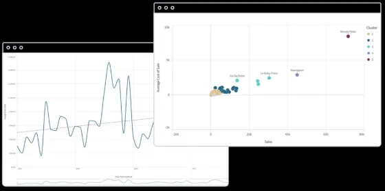
Nine tools you will not find in the usual roundup, one shared dataset, and three questions that decide the choice faster than any feature list. With real screenshots, head-to-head differences, and a recommended stack for each role.
Why most tool roundups fail you
Search for “best data visualization tools” and you get the same three names at the top of every list, followed by the same stock phrases: powerful, intuitive, enterprise-grade. Those three products are fine. They are also the only ones most people have ever evaluated, which means a lot of teams are paying for a platform that does not match their actual job.
The problem is that these lists compare tools as if everyone has the same problem. An analyst maintaining a live dashboard for a sales team, a founder assembling a board pack from a spreadsheet, and a consultant turning four client exports into a deck are solving three different problems, and the tool that wins one of them is often the worst option for the others.
This guide deliberately skips the household names. It sorts nine less obvious tools into four groups by what they produce, runs the same dataset through five of them and records how long each took, then gives a two-tool stack for each role. If you already know your situation, skip to the stacks at the end.
Three questions that decide the tool
Feature comparisons mislead because most features never get used. Three questions do nearly all of the work.
- Will this chart be looked at once or repeatedly? A monthly metric that people return to needs a live connection and a refresh cycle. A chart for a slide is looked at once and can be built from a snapshot.
- Where does the data live right now? In a database or warehouse, you want a tool that connects. In a spreadsheet or an email attachment, you want a tool that accepts a paste.
- Who has to read it, and do they need a licence? Per-seat pricing is fine for a ten-person analytics team and ruinous for a client, a board, or a company-wide audience.
| Question 1: looked at once or repeatedly? | ||
| Repeatedly
Dashboard platform: Qlik Sense, ThoughtSpot, Superset, Zoho Analytics |
Once, no code
Chart maker: RAWGraphs, Infogram, ChartGPT |
Once, you write code
Notebook or app: Hex, Streamlit |
The first question sorts most people into the right group before any product names come up.
The tools
Grouped by what they produce. Each entry has a one-sentence definition, a screenshot, and a verdict strip.
Qlik Sense
A business intelligence platform built around an associative engine that lets users click any value anywhere and see every related field update instantly.
Most dashboard tools filter data in a fixed direction: you pick a region, then a product, then a period. Qlik loads the whole data model into memory and keeps every field associated with every other field, so selecting a value in any chart highlights what is related in green and what is excluded in grey across the whole app. It is a different way of exploring data, and people who learn it tend not to want to go back.
Qlik Cloud is the hosted version and includes an AI assistant for natural language questions, automated insight suggestions, and alerting. A self-managed edition exists for organisations that need to run it on their own servers. The costs are per-user subscriptions that scale with the tier, and the data load scripting layer, which is powerful, has its own syntax to learn.
| Best for
Exploratory analysis across many related tables by an internal team |
Avoid when
You need one static chart, or your readers will not have licences |
Cost
Per-user subscription tiers on Qlik Cloud; self-managed licensing available |
ThoughtSpot
A ThoughtSpot Liveboard, where each panel is a saved search answer pinned to a shared board.
ThoughtSpot connects directly to warehouses such as Snowflake, BigQuery, Databricks, and Redshift and queries them live. The interface is a search bar with autocomplete over your column names and values, so “sales by region last quarter” returns a bar chart without anyone building it. Answers are pinned to Liveboards, which behave like dashboards with filters and drill-down. The natural language layer has become the main way most users interact with it.
The catch is that search only works well on a clean, well-modelled warehouse, so the analytics team still does the hard work upfront, and pricing is at the enterprise end of the market. It is a poor match for a founder with data in spreadsheets or a consultant who cannot connect to the client’s systems.
| Best for
Self-serve questions by business users on a governed warehouse |
Avoid when
Data is not in a warehouse, or the budget is small |
Cost
Enterprise pricing by user or consumption; a free trial is available |
Apache Superset
An open source dashboard platform with a SQL editor, a chart builder covering dozens of types, and no licence fees at all.
Superset came out of Airbnb and is now an Apache project. It connects to almost any SQL database, gives analysts a SQL Lab for writing and saving queries, and a point-and-click explore view for turning a query into any of a large library of chart types. Charts are arranged on dashboards with native filters, and the whole thing is self-hosted, so the only cost is the server and the person who runs it. Preset offers a hosted version for teams that do not want to run it themselves.
The trade-off is that it expects an engineer. Installation, upgrades, permissions, and performance tuning are all your problem, and the chart defaults are functional rather than polished. Non-technical users can build charts once a dataset has been prepared for them, but not before.
| Best for
Engineering-led teams that want full dashboards without per-seat costs |
Avoid when
Nobody can host and maintain it, or output goes to clients |
Cost
Free and open source; Preset hosts it with a free starter tier |
Zoho Analytics
A cloud BI tool aimed at small and mid-sized businesses, with hundreds of prebuilt connectors and pricing that starts at a few seats.
Zoho Analytics sits in the space between spreadsheets and enterprise BI. It imports from files, databases, and a long list of business applications including CRMs, accounting tools, ad platforms, and help desks, then lets users build reports and dashboards with a drag-and-drop editor. An AI assistant answers questions in plain language, and the data preparation module handles cleaning and joins without code. Pricing is per user with a low entry point, which is the reason a lot of small companies end up here.
Its visuals are competent rather than distinctive, and very large data sets are better served elsewhere. It is at its best as the single place where a small company’s scattered SaaS data comes together into one monthly view.
| Best for
Small companies consolidating data from many business applications |
Avoid when
Data volumes are very large or the design bar is high |
Cost
Limited free plan; paid per-user tiers from a small number of seats |
RAWGraphs
An open source browser tool for unusual chart types, such as alluvial, bump, beeswarm, and sunburst, that most other tools do not offer.
RAWGraphs began at a design research lab in Milan as a bridge between spreadsheets and vector editors. You paste or upload data, pick from a gallery of around thirty chart types, map columns to visual dimensions such as size, colour, and hierarchy, adjust settings, and export as SVG to finish in a design tool, or as PNG to use directly. Processing happens in the browser, so nothing is uploaded to a server.
Because it is built for the charts that standard tools skip, it is not the place to go for a simple bar or line chart; those are quicker elsewhere. There is no dashboarding, no live data, and the interface assumes you already know which chart form you want. Designers and researchers use it constantly; most business users never will.
| Best for
Flows, hierarchies, and rankings over time that standard charts cannot show |
Avoid when
You need ordinary charts quickly or a live connection |
Cost
Free and open source |
Infogram
A template-based maker for infographics, interactive charts, maps, and full reports, aimed at marketing and communications teams.
Infogram, owned by Prezi, works from a library of templates for charts, maps, infographics, social posts, and multi-page reports. You pick a layout, drop in data through a spreadsheet-style editor or a Google Sheets link, and adjust colours and fonts. Output can be embedded, downloaded as an image or PDF, or shared as an interactive web page. The template library is what people pay for, and it is large.
The template is also the constraint. Fine control over layout is limited, and the chart types are the standard ones. It is a strong choice for a marketing team producing branded visuals at volume, and a weak choice for analysts who need precision.
| Best for
Branded infographics and reports for marketing and communications |
Avoid when
You need analytical precision or dashboards |
Cost
Free plan with Infogram branding; paid Pro, Business, and Team tiers |
ChartGPT
A prompt-driven chart maker: paste a table or describe the numbers, get a presentation-ready chart in about twenty seconds.
The product is a single input box and a canvas. Input can be a range copied out of Excel or Google Sheets, a CSV upload, or numbers typed into a sentence, up to 500 rows. Headers become axis labels and series names. If you name a chart type it uses it; if you do not, it picks one from the shape of the data, so time series become lines and shares of a total become donuts. Nine chart types are supported: bar, horizontal bar, grouped bar, stacked bar, line, area, pie, donut, and scatter. Export is PNG, SVG, or PDF, plus the chart specification as JSON.
What distinguishes it is the set of charting conventions baked into the defaults. Bars always start at zero. One series gets one colour, and if you ask to highlight one bar the rest go grey. Titles state the finding rather than the variable names, so a chart is captioned “Q4 was the strongest quarter” instead of “Revenue by quarter”. It copes with messy input such as merged headers, stray totals rows, and mixed date formats, and it asks a question when a value is ambiguous rather than guessing silently. Nothing is stored after export, and there is no chart history on any plan.
The trade-off is scope. It does not connect to databases, does not refresh, and does not build dashboards. Colours and axis ranges are chosen automatically and cannot be manually overridden, which is a problem for a strict corporate palette.
| Best for
Single charts for decks and documents, especially in volume from pasted data |
Avoid when
You need a dashboard, a live connection, or exact brand colours |
Cost
Free to try without an account; paid Pro and Team plans; an API is available |
Hex
A collaborative notebook where SQL, Python, and no-code chart cells sit side by side, and any notebook can be published as an interactive app.
Hex connects to warehouses and databases and gives analysts a notebook made of cells. A SQL cell returns a dataframe, a Python cell transforms it, a chart cell visualises it with a point-and-click builder, and an input cell adds a dropdown or a date picker. Cells run in dependency order rather than top to bottom, so changing an input updates only what depends on it. When the analysis is done, the notebook publishes as an app with the code hidden and the inputs exposed, which is how it replaces a lot of one-off dashboards.
Pricing is per editor, with viewers of published apps typically cheaper or free depending on the plan. It assumes at least one person on the team is comfortable in SQL. For a pure business user with no analyst support it is too much tool.
| Best for
Analysts who mix SQL and Python and need to share results as apps |
Avoid when
Nobody on the team writes SQL |
Cost
Free Community tier; paid Team and Enterprise per editor |
Streamlit
An open source Python framework that turns a script into a web app with charts, inputs, and layout in a few dozen lines.
Streamlit, now owned by Snowflake, is the fastest route from a Python analysis to something a colleague can open in a browser. Write a script, call functions such as st.bar_chart or st.slider, run it, and a web app appears. It works with Matplotlib, Plotly, Altair, and Vega charts, and its built-in chart functions cover the basics with sensible defaults. Community Cloud hosts public apps for free from a GitHub repository.
It is not a dashboard platform. There is no query builder, no permissions model of its own, and every chart is code. The app reruns the script on each interaction, which gets slow on heavy computations unless you cache carefully. For an analyst who already has a Python analysis and wants to share it, nothing is quicker.
| Best for
Turning a Python analysis into a shareable internal app |
Avoid when
The team does not write Python, or you need governed dashboards |
Cost
Free and open source; Community Cloud hosting is free for public apps |
One dataset, five tools
To make the differences concrete, the same file was run through five tools: a CSV of quarterly revenue by region for two years, eight rows by four columns, with one merged header and a totals row at the bottom, because that is what real exports look like. The task was a single grouped bar chart suitable for a slide, with the strongest region highlighted. Times are from opening the tool to having an exportable image, measured by someone familiar with each product.
| Tool | Time | What happened |
| ChartGPT | 40 sec | Paste, one sentence describing the highlight, generate. It flagged the totals row and asked whether to exclude it. Exported SVG. |
| Infogram | 5 min | Delete totals row, fix the header, pick a grouped bar template, paste into the data editor, recolour the highlighted series, download PNG. |
| RAWGraphs | 8 min | Clean the file, upload, choose the grouped bar chart, map columns to dimensions, adjust colour scale. Exported SVG and finished the highlight in a vector editor. |
| Hex | 9 min | Upload the CSV, one Python cell to drop the totals row and reshape, a chart cell for the grouped bars, then a colour rule for the highlight. Trivial to rerun when the file changes. |
| Zoho Analytics | 18 min | Import, fix the header during import, build the report, format it, then export. Overkill for one chart, but a second chart from the same import takes two minutes. |
The order is not a ranking. Zoho is slowest here because it front-loads the work into an import that pays off across many charts and many months. The chart makers are fastest because they do nothing but the chart. The bench simply makes visible what each tool is optimised for.
A dashboard tool used to make one chart for a deck is slow. A chart tool used to monitor a business is a monthly rebuild. Both mistakes come from skipping the first question.
Head-to-head differences
Five pairings come up constantly, and in each case the tools look similar on paper and behave very differently in practice.
Qlik Sense versus ThoughtSpot
| Qlik Sense
Loads the data model into its own engine and explores by association: click anything, see everything related. Strong for analysts working across many joined tables. Requires learning its load scripting, and the model has to be refreshed rather than queried live. |
ThoughtSpot
Leaves the data in the warehouse and queries it live through search and natural language. Strong for business users asking their own questions. Depends entirely on a well-modelled warehouse and sits at enterprise price points. |
The practical rule: if the analytics team wants to explore, choose Qlik. If the goal is to get business users answering their own questions on a clean warehouse, choose ThoughtSpot.
RAWGraphs versus ChartGPT
| RAWGraphs
Around thirty chart forms, including alluvial, bump, and beeswarm, with manual mapping of columns to visual dimensions and SVG export for finishing in a design tool. Slower per chart, assumes tidy data and a clear idea of the chart form. Free. |
ChartGPT
Nine standard chart types, chosen and drawn from a prompt, with good practice enforced by default and messy input tolerated. Faster in volume and needs no cleanup pass. No exotic forms, and colours and axis ranges cannot be manually set. |
The practical rule: RAWGraphs when the shape of the data needs an unusual chart and you will finish it by hand. ChartGPT when the chart is standard, it is going into a deck, and you have many to make from imperfect spreadsheets.
Apache Superset versus Zoho Analytics
| Apache Superset
Free, self-hosted, connects to any SQL database, and gives analysts a full SQL editor. Needs an engineer to install and maintain, and non-technical users depend on prepared datasets. |
Zoho Analytics
Hosted, connects to business applications through prebuilt connectors, and lets non-technical users import and build without help. Per-user pricing, and less depth for analysts who want SQL. |
The practical rule: Superset when the data is in your own database and you have engineering time; Zoho Analytics when the data is scattered across SaaS tools and nobody has engineering time.
Hex versus Streamlit
| Hex
A hosted notebook where SQL, Python, and no-code chart cells share one workspace, with permissions, scheduling, and one-click publishing built in. Non-coders can adjust a chart cell without touching code. Paid per editor once the team grows past the free tier. |
Streamlit
A free framework where the whole app is a Python script you host yourself. Total control and no per-seat cost, but every chart, input, and layout decision is code, and permissions, scheduling, and hosting are your responsibility. |
The practical rule: Hex when the analysis is shared by a team that includes non-coders and you want the hosting handled. Streamlit when the team is Python-first, wants to own the deployment, and would rather spend time than money.
Infogram versus RAWGraphs
| Infogram
Templates for standard charts, maps, and full infographic layouts, with brand colours, fonts, and interactive embeds. Fast for a marketing team producing many branded visuals. Standard chart types only, and layout control stops at what the template allows. |
RAWGraphs
Around thirty chart forms including the unusual ones, mapped by hand from columns to visual dimensions, with SVG export for finishing in a design tool. No templates, no branding features, no embeds. Free, and nothing leaves the browser. |
The practical rule: Infogram when the output is a branded piece for an audience and the chart types are ordinary. RAWGraphs when the data has a shape that ordinary charts cannot show and a designer will finish the result.
Comparison table
| Tool | Produces | Data input | Code needed | Time to first chart | Free tier |
| Qlik Sense | Associative dashboards | Live connections, load scripts | Scripting helps | Hours | Trial only |
| ThoughtSpot | Search answers, Liveboards | Cloud warehouses | No | Minutes on a ready warehouse | Trial only |
| Apache Superset | Dashboards, SQL Lab | SQL databases | SQL and hosting | An afternoon | Open source |
| Zoho Analytics | Reports and dashboards | Files, databases, SaaS connectors | No | Under an hour | Limited free plan |
| RAWGraphs | SVG and PNG charts | Paste, file | No | Minutes | Fully free |
| Infogram | Infographics, embeds, reports | Paste, file, Sheets link | No | Minutes | Yes, with branding |
| ChartGPT | Static chart files | Paste, CSV, prompt | No | Seconds | Yes, no account needed |
| Hex | Notebooks, published apps | Warehouses, files | SQL or Python | Minutes if you code | Community tier |
| Streamlit | Python web apps | Code | Python | Minutes if you code | Open source |
A stack for each role
Nobody should use one tool for everything. Each role below gets a primary tool for the recurring work and a secondary tool for the one-off chart, with the reasoning.
Analysts
The primary tool depends on what the organisation already runs and who does the maintenance. Qlik Sense where an analytics team wants deep exploration and has budget; Apache Superset where engineering can host it and licence costs matter; ThoughtSpot where the priority is business users serving themselves on a governed warehouse.
The secondary tool is for the question a stakeholder asks in a meeting and wants answered by the afternoon. Hex is the strongest option, because the SQL and the chart live in one notebook that can be rerun when the question comes back with a twist, and published as an app if it keeps coming back. Streamlit does the same job for teams that are Python-first and want to own the hosting.
Recommended stack: Qlik Sense, Superset, or ThoughtSpot for dashboards, plus Hex or Streamlit for ad hoc analysis.
Founders
A founder’s charts go to three places: the internal metrics review, the board pack, and the investor update. For the internal review at a small company, Zoho Analytics is the practical choice because it pulls the CRM, accounting, ad platform, and support data into one place without an engineer. A startup with an engineering team and a real database can run Superset instead and pay nothing in licences.
The board pack and investor update are different. The numbers usually live in a spreadsheet, the chart has to look finished without a design pass, and the same chart is rebuilt every month with new figures. Paste the monthly table into ChartGPT, say what the chart should show, and export an SVG that stays sharp in the deck. Because the palette is consistent from chart to chart, a pack assembled from several sources still reads as one document.
Recommended stack: Zoho Analytics or Superset for internal metrics, plus ChartGPT for the monthly board and investor charts.
Consultants
Consultants have the least control over where data comes from and the highest standard for how output looks. Client data arrives as Excel attachments, exports from systems the consultant cannot access, and occasionally as a photo of a table. There is rarely time to connect anything to anything, and the deliverable is almost always a deck or a written report.
That rules out dashboard platforms for most engagements and points to the tools that take a paste and return a file. ChartGPT is the faster choice when the job is volume, such as a dozen charts from several client spreadsheets in one sitting, because it tolerates untidy input and keeps every chart on the same palette. RAWGraphs earns its place for the one chart in the deck that needs to show a flow or a ranking over time, which no standard chart type handles. Infogram fits when the deliverable is a designed report rather than a slide deck. For engagements that end with a live dashboard handed to the client, Qlik Sense or ThoughtSpot is usually the choice, decided by what the client already licenses.
Recommended stack: ChartGPT for deck charts, RAWGraphs for the occasional unusual chart, plus whichever dashboard platform the client already owns.
Mistakes to avoid
- Mixing tools inside one deck. Charts from two sources are visible immediately. Pick one chart tool per document and stay with it.
- Buying a BI platform for a spreadsheet problem. If the data lives in a file that changes monthly, a dashboard platform adds cost and setup time without adding value.
- Rebuilding the same chart by hand every month. If you find yourself doing this, either connect the data to a dashboard tool or move the monthly job to a chart maker that accepts a paste.
- Choosing an exotic chart type because the tool offers it. An alluvial diagram is the right answer for flows and the wrong answer for almost everything else. Use the unusual forms when the data demands them.
- Ignoring who has to read it. A dashboard that the board cannot open without a licence is a chart that does not exist.
Conclusion
There is no single best data visualization tool, but there is a clear best tool for each kind of work, and the first question sorts you in seconds. Charts that people return to belong in Qlik Sense, ThoughtSpot, Superset, or Zoho Analytics, depending on budget and existing stack. Charts that go into a slide or a document belong in a tool that takes a table and returns a file: RAWGraphs, Infogram, or ChartGPT. Anyone comfortable in SQL or Python should add Hex or Streamlit and skip most of the rest.
Decide by where the data lives, whether the chart is seen once or repeatedly, and who has to read it. Get those three answers right and the product choice makes itself.