Halloween Poster Printing: Custom Posters for Events, Shops & Businesses
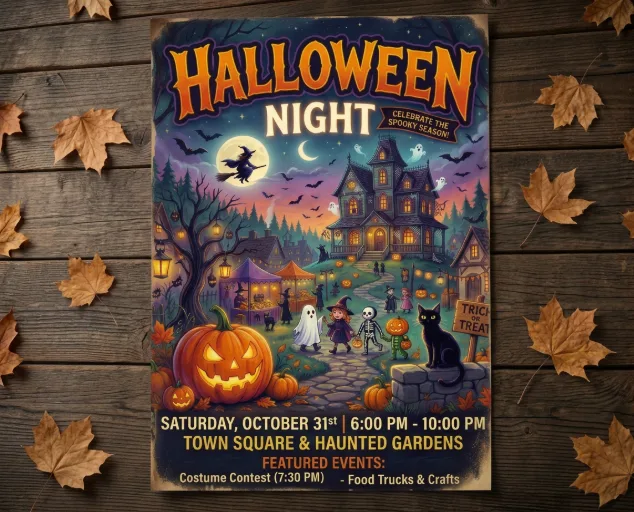
Almost everything about Halloween artwork leans on what screens do best. Deep blacks that look bottomless, oranges that seem to glow, and purples with a faint electric edge. On a monitor it all looks superb, because the screen is lighting the design from behind.
Print works the other way round. A poster only reflects the light the room gives it, which might be shop strip lighting, a school hall’s daylight, or a pub’s warm bulbs. Closing that gap is the real starting point for any Halloween poster printing project, and it shapes what follows: where the poster goes, how far away it will be read, and how much the artwork can be trusted to survive the trip from screen to wall.
Halloween Poster Printing Starts With the Setting, Not the Design
A poster in a shop window, one in a village hall corridor and one behind a bar have almost nothing in common except the date. They differ in reading distance, lighting, how long people have to look and how many pass by each minute, and each of those changes what the print needs to do. Starting from the wall rather than the artwork tends to lead to better decisions, and it is the thinking that makes an order for custom Halloween posters easier to get right.
It also helps to separate being noticed from being understood. Halloween imagery is eye-catching by design, so a glance is seldom the hard part. What matters is what the viewer has taken in a second after the glance: what it is, when it is, and whether it is for them.
Halloween Event Posters: Readable in One Pass
Event posters get read on the move: in a queue, along a corridor, while waiting for someone. A Halloween event poster has to give away what it is and when it happens in the time it takes to walk past, which argues for fewer words, a larger type, and one detail that cannot be missed. These posters also tend to go up in several places at once, on noticeboards, at entrances, and near reception, so quantity becomes a planning question rather than an afterthought.
Audience matters too. A poster for a family event is read by adults deciding whether to go and, sometimes, by children at a lower eye line; a poster for an adult evening at a venue is read in a very different mood. Both are valid, but the tone and the position of the key detail should match who is doing the reading.
Shop and Window Posters: Dealing With Glare
Glass reflects. A poster facing outwards has to compete with the street behind the viewer, and dark artwork with subtle detail is often the first thing to disappear in daylight glare. Inside the shop the same poster is seen at close range by people who have stopped moving, so finer detail and more information can earn their place there. Window versions generally need bolder shapes and stronger contrast; till-side versions can afford to be more considered.
Venue and Workplace Posters: Consistency Over Volume
Restaurants, bars, gyms, schools and offices tend to run Halloween across several touchpoints at once: menus, social posts, doors, tables. A poster that looks unrelated to everything else in the space reads as an afterthought, however good the artwork is. Keeping the palette and typography close to existing branding matters more than adding effects, and it makes the poster look planned rather than bought in a panic. The real cost of a weak poster is less the print bill than the weeks it spends in the best position in the building without doing its job.
| Setting | What it competes with | Settle this before ordering |
| Shop window | Glass reflections, daylight, passing pace | Bold shapes and strong contrast, judged from the pavement side |
| Shop interior or checkout | Shelving, neighbouring displays, close viewing | How much detail is worth including for people who have stopped |
| Community or school event | Crowded noticeboards, other notices | A clear headline and date, plus enough copies for every entrance |
| Pub, restaurant or venue | Low, warm lighting; menus and screens | Artwork that stays legible in dim rooms and matches existing branding |
| Office or reception | Neutral lighting, a more formal setting | Restrained styling that still reads from standing or seated distance |
Custom Halloween Posters and Dark Artwork: What Changes Between Screen and Paper
Dark palettes are the hardest to judge on a monitor. Large areas of black or deep purple can look rich on screen and flatter, or less detailed, on paper, depending on the artwork, the paper and the printing process. Detail sitting inside dark areas can vanish altogether, and thin light lettering on a dark ground tends to be the first casualty of glare and distance.
That matters most for illustrated Halloween poster art, where a scene full of texture can look impressive up close and turn into a dark block from across a room. If you design a Halloween poster for print, give the message one clear focal point, thicken the key lettering and avoid relying on dark-on-dark texture to carry meaning. The same principle applies when using a Stretch Fabric Display for a larger Halloween backdrop, where artwork needs to remain clear and recognisable from further away. Checking a printed proof or test sheet at reading distance is not a technical standard, but it is a useful check, because it shows what a viewer will actually see rather than what the monitor flatters.
Before approving artwork, it helps to check that:
- the headline and date can be read at the distance the poster will be viewed
- detail inside dark areas has not merged into one block
- light lettering on dark backgrounds is heavy enough to survive glare
- the colours suit the lighting of the room the poster is going into
Exact file requirements, sizes and finishes are a subject of their own, covered in the guide to poster sizes, paper and finishes; here the point is simply that those decisions get easier once the setting is known.
Printable Halloween Posters or Professional Printing: Where the Line Sits
Printable Halloween posters, meaning downloadable designs run off at home, are a perfectly reasonable answer for a one-off party or a classroom wall. The limits show up when a poster has to be read from a distance, hang in several places or represent a business. Home printers are constrained by paper size and can struggle with large dark areas of colour, and a set of A4 sheets taped into one bigger image rarely looks intentional. Professionally printed Halloween posters avoid many of those constraints, which is why they suit shops, venues and organised events better.
Posters are not always the right answer either, and it is worth being straight about that. The comparison below is deliberately broad.
| Format | Suits best | Less suited to |
| Halloween posters | A flat message on a wall, window or noticeboard | Spots with no surface to mount on |
| Banners | Wide messages read from further away, such as across an entrance | Small indoor spaces where a wide format cannot hang |
| Halloween signs | Rigid displays and directional messages | Messages needed in many copies across several locations |
| Flyers | Hand-to-hand details and counter-top take-aways | Catching attention from across a room |
Fuller comparisons between these formats deserve their own space. Where a wall or window is available and the message is a single, flat one, the Halloween posters range is a straightforward place to begin.
Common Halloween Poster Mistakes That Only Show Up Once It Is Printed
The avoidable problems tend to be visible on a wall and invisible on a screen. The first is information overload: a poster that tries to carry the full programme, prices and terms is doing a flyer’s job, and the reader moves on before reaching the date. The second is height. A poster hung above the natural eye line, or behind a display, is likely to go unread however good it looks. The third is treating every location alike. The same design can run across a venue or a shop group, but details such as the room, the time or the offer sometimes need adjusting per location, and it is easier to plan these before printing than to fix them afterwards with a marker pen.
Ordering Halloween Posters: Quantity, Turnaround and UK Delivery
Halloween has a fixed end date, which makes this print different from most others. A poster for an October event has a useful life measured in weeks and has little use the day after. That reverses the usual instinct to keep polishing the design: the sensible approach is to work backwards from the date the posters need to be on the wall, leave time for checking artwork and delivery, and confirm production and delivery times when ordering, since they vary with size, quantity and finishing.
Quantity follows surfaces, not audiences. Count entrances, windows, noticeboards and checkout areas, then add a few spares, because posters in public places do get damaged or taken. Mixed sizes can make sense too, with a larger poster for the window and smaller ones for the till or noticeboards, provided the artwork is prepared with each format in mind. Ordering through I YOU PRINT keeps the practical side simple: choose the poster online and have the finished prints delivered to a UK address, from a London shopfront to a venue further afield.
The step that gets skipped when time is short is the artwork check, which is also the step most likely to catch problems in dark areas. A few minutes with a printed test sheet costs far less than discovering the problem on a full run.
A simple order sequence:
- Decide where each poster will hang and how far away people will read it.
- Choose a size and format for that position, not simply the largest available.
- Check the artwork at reading distance, paying attention to dark areas and small text.
- Set quantity by location count, plus a small allowance for replacements.
- Work backwards from the display date to the latest sensible order date.
Before You Order: Judge the Poster Where It Will Hang
Good Halloween poster printing starts with asking where a poster will be read before deciding how it should look. Shop windows, event corridors and dim venues each reward different choices, and dark artwork needs more checking than a screen preview suggests. Settle the setting, judge the artwork at reading distance, and the poster has a fair chance of looking on the wall the way it looked on the monitor.