The Photograph Has Become the Heart of the Funeral Order of Service
Why funeral photography carries more weight in modern memorials, and what that means for the booklet you plan, design and print.
Of all the decisions packed into the days before a funeral, choosing one photograph can be the one that catches a family off guard. The music usually has an answer. So do the readings. But scrolling through years of phone pictures, looking for a single image that looks like them, not a blurry holiday snap and not a passport-style stiffness, can take an entire evening and still end without agreement.
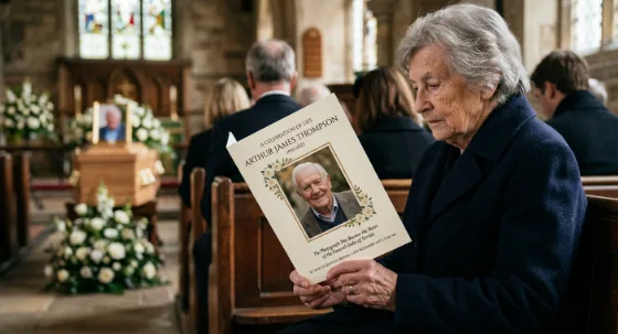
That difficulty says a lot about the modern funeral order of service. The photograph is no longer a decorative extra on the front. For many families it is the reason people keep the booklet at all. Long after the hymn numbers have been forgotten, the face on the cover is what stays propped against a clock on the mantelpiece or tucked inside a favourite book.
This piece looks at why funeral photography matters more in modern services, what that changes about how an order of service booklet should be planned and printed, and where good intentions tend to go wrong between the camera roll and the finished print.
Why Funeral Photography Matters More in Modern Memorials
From a Formal Portrait to a Life Told in Pictures
Not so long ago, the order of service was mainly a liturgical document. It set out the hymns, prayers and committal, sometimes with a single formal portrait on the front and sometimes with no image at all. That format still suits many services, particularly those following an established religious order, and there is nothing old-fashioned about it.
Alongside it, though, the celebration-of-life service has become a familiar choice in the UK, and it brings a different expectation. Families want the service to sound like the person, and increasingly to look like them too. A photograph of someone on their allotment, at the wheel of a car they spent years restoring, or laughing at a family wedding communicates something a paragraph of tribute struggles to reach. The booklet has gradually shifted from a running order into a short visual biography.
The Camera-Roll Paradox
Most families now hold more photographs of their loved one than any generation before them. You would expect that to make the job easier. Often it doesn’t.
Images are scattered across several phones, cloud accounts and social media profiles. Many were taken in poor light. Some exist only as compressed copies that looked perfectly fine on a screen and fall apart once printed at A5. Abundance creates choice, and choice under grief and time pressure is exhausting. Knowing early which photographs will actually print well removes a surprising amount of that strain, which is why the practical guidance further down matters as much as the emotional decision.
Photographs Taken on the Day
Funeral photography now also means something newer: recording the service itself. Some families ask a relative or a professional photographer to capture the flowers, the gathering and the people who came, especially when close family could not travel. It isn’t right for everyone, and attitudes vary between faiths, cultures and individual families, so it is worth agreeing it in advance with the family, the celebrant or minister, and the venue. Where it does happen, those images often find a second life in a memorial booklet printed later, for an anniversary or for relatives who weren’t able to be there.
How Photographs Work Across a Funeral Service Booklet
A photograph does a different job depending on where it sits. The cover has to be recognised instantly by everyone in the room. Inside pages need to support the running order without competing with it. The back page is what people turn to last, and it shapes the feeling they leave with.
| Position in the booklet | What the photo needs to do | What tends to work | Common pitfall |
| Front cover | Be recognised immediately by every guest | A clear, well-lit head-and-shoulders or half-length image with the face large in frame | A group photo cropped so tightly the face loses detail |
| Inside pages | Accompany the service details without crowding them | One or two smaller images beside the tribute or eulogy | Filling every margin until the hymn words become hard to follow |
| Centre spread (8+ pages) | Show the shape of a whole life | A loose timeline: childhood, work, family, later years | Placing very different image qualities side by side |
| Back cover | Leave people with something to hold onto | A favourite candid shot, a short verse or a closing message | Repeating the cover image and wasting the space |
The inside pages deserve particular care. Mourners use the booklet during the service, often in dim church or crematorium lighting, and some are older guests reading lyrics they don’t know by heart. A collage that looks lovely on a screen can make the words beside it harder to follow in the moment they’re needed. Photography should frame the service, not bury it. If you want to see how layout, pages and photographs come together in practice, our funeral order of service printing page sets out the available options.
Choosing Photos That Will Print Well
Why a Sharp Phone Image Can Still Print Badly
Screens are forgiving. They are backlit, small and viewed at arm’s length, so slight softness or compression rarely shows. Print reveals everything. An image that has been downloaded from a social media profile or forwarded through a messaging app has usually been compressed along the way, and the original file sitting on someone’s phone is almost always the better source. It is worth asking the person who took the photo to send the original rather than relying on the copy that has been shared around the family.
Resolution matters most for the cover. A commonly used print guideline is around 300 pixels per inch at final size, which for a full-bleed A5 cover works out at roughly 1,750 by 2,480 pixels. That isn’t a hard rule, and a slightly smaller image can still look acceptable, but the further below it you go, the more likely faces are to look soft. Images that run to the edge of the page also need a little extra around them, known as bleed, so nothing important gets lost when the booklet is trimmed.
Old Prints, Scans and Mixing Eras
Many of the most treasured photographs exist only as prints in an album. Scanning them flat, at a high setting, gives a far better result than photographing them on a table, where glare and angle distort the image. Mixing eras can also create a visual jolt: a faded 1970s colour print beside a crisp recent phone photo. Some families convert everything to black and white to unify the set, while others prefer to keep the colours as they were because the warmth of an old print is part of the memory. Neither is wrong; it’s a choice worth making deliberately.
Before any artwork is sent for print, it’s worth checking that:
- each photograph is the original file, not a screenshot or a messaging-app copy
- the face on the cover is large and in focus when viewed at actual print size
- older prints were scanned flat rather than photographed at an angle
- names, dates and spellings have been checked by more than one family member
- faces and text sit comfortably clear of the trim edge
Funeral Order of Service Design and Printing: Format, Paper and Finish
Choosing the Right Format and Page Count
The number of photographs you want to include is one of the most reliable ways to decide on format. A single folded card gives four pages, which suits a shorter service. Stapled (saddle-stitched) booklets are built in multiples of four pages, so more pages means more room for a photo timeline, tributes and readings. The guide below is illustrative rather than a fixed rule, since every service and every family’s photo collection is different.
| Format | Page count | Realistic photo use | Often suits |
| Folded card | 4 pages | Cover portrait plus one or two inside | Shorter services with a simple running order |
| Saddle-stitched booklet | 8 pages | Cover, a small selection inside, a back-page image | Services with tributes, readings and a few hymns |
| Saddle-stitched booklet | 12–16 pages | Room for a centre-spread timeline | Celebration-of-life services and keepsake-focused booklets |
Paper and Finish for Photographs
Paper changes how a photograph feels in the hand as much as how it looks. A heavier stock gives the booklet a more substantial, considered feel, which matters for something people intend to keep. Silk or satin-coated paper tends to hold photographic detail well while producing less glare than high gloss, a practical consideration under overhead church lighting. Uncoated stock has a softer, more tactile character, though photographs on it can appear slightly less crisp. The right choice depends on the images themselves and the feel the family wants, so it’s worth checking the specification of each option rather than assuming.
Quantities, Proofing and Timing
Funeral timescales in the UK are often short, so it helps to plan backwards from the date of the service. Allow time for gathering photographs, designing the layout, approving a proof and delivery. Order a sensible margin above expected attendance, plus copies for anyone who couldn’t come; running short at the door is far more upsetting than having a few left over.
Proofing deserves more attention than it usually gets. A misspelt name or wrong date in a funeral service booklet is the kind of error families remember. At I YOU PRINT, our personalised funeral booklets go through a proofing stage so the family can review every page before anything is printed.
Beyond the Booklet: Photographs Across the Memorial Space
Once a family has gathered the right images, they rarely stay in one place. A large photograph printed as one of a few simple posters and set on an easel at the entrance gives arriving guests a moment to pause before they take their seat. At the reception or wake, a printed banner featuring a favourite image can turn a function room into somewhere that feels connected to the person.
For larger memorials, such as a community figure, a long-serving colleague or a celebration of life held in a hall, a stretch fabric display stand or an SEG fabric display can work as a photo wall, holding a timeline of images at a scale everyone can see. These formats are lightweight and can often be reused for an anniversary gathering.
Honesty matters here. An intimate crematorium service for a small group rarely needs a large fabric display, and a single framed poster may say everything that needs saying. Larger display formats earn their place when the gathering is big, the venue is spacious, or the images will be used again.
Photographs often travel beyond the day too. Families may print memorial booklets later for an anniversary, and when copies need posting to relatives overseas, sturdy mailer boxes protect the booklet so it arrives looking the way it did on the day.
Mistakes That Undo a Good Photograph
The most avoidable problems tend to happen late, when time is shortest:
- choosing a cover image for sentiment alone when the face is tiny or out of focus, rather than moving that photo inside
- cropping a group shot so tightly that the face blurs
- letting photographs crowd the hymn words and readings
- leaving proof approval to one person late at night
- ordering exactly the number of expected guests with nothing spare
Getting the Funeral Order of Service Right
Photography has changed what people expect from a memorial. The funeral order of service has become the one physical thing guests take home, and the photographs inside it are what turn a running order into a keepsake. Choosing images that print well, giving the service details room to breathe and selecting paper that suits the photographs are small decisions, but together they decide whether the booklet is glanced at once or kept for years.
When the photographs are chosen, I YOU PRINT can turn them into an funeral order of service booklet that looks the way the family hoped it would.