Designing a Party Around Color: How Event Details Create a Cohesive Look
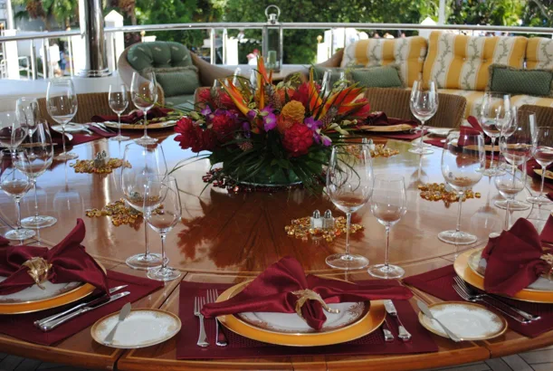
A single mismatch—like soft blush linens and sage florals clashing against a bright cobalt bar—can instantly break your party’s visual harmony. When key details fight for attention, a curated space quickly devolves into a collection of random choices.
Creating an effortless, high-end look doesn’t mean making every element identical. Simple, intentional color connections across your furniture, décor, and serving stations will seamlessly tie the entire celebration together.
Here is how to build a cohesive palette that elevates your event without overwhelming the room.
Build a Party Color Palette
A clear palette gives you a starting point for choosing flowers, linens, furniture, and serving pieces. A 2024 report from C&IT notes that event designers use bold colors and layered designs to draw in attendees. For a party, the same idea can help a room feel lively while keeping the details connected.
A simple palette can start with three roles:
- One main color
- One supporting shade
- One neutral base
For example, leafy green can lead, peach can add warmth, and ivory can give the eye a break. Check your colors in the actual space, too, since daylight and indoor lighting can change how a shade looks.
Create Your Core Color Palette
You don’t need to use every shade in equal amounts. Instead, intentionally repeat one or two key colors in different places so guests notice a connection as they move through the room.
Mix the Details
A peach napkin might echo a flower, while green glassware picks up the color of nearby foliage. Using different textures keeps those repeats from feeling too planned. Try linen, glass, warm wood, or fresh greenery to bring wide variety into the palette.
Consider where guests will look first, such as the entrance or dining table, and place a stronger color there. Let softer shades carry the connection into nearby areas.
Use Color to Guide Guest Flow
Strategic color choices can easily help guests find their way around a large room or outdoor space. A clear visual cue can distinguish the welcome area from the main dining space, bar, or dance floor. That way, guests can intuitively find what they need without constantly asking for directions.
Keep these cues easy to spot but subtle enough to fit the celebration. A colored menu card, small custom sign, or fabric marker near an entrance can make each area feel inviting and intuitive.
At an outdoor event, repeat a cue at key turns or transitions where guests might pause. Thoughtful wayfinding ultimately helps people settle in much faster.
Give Rentals a Role
Furniture and serving stations serve a practical purpose, but they also occupy significant visual space. Choosing these large pieces with your overall color palette in mind creates a cohesive look without cluttering surfaces with extra decor.
A central beverage hub naturally draws foot traffic and gives guests a focal point to gather around. When selecting a physical bar or counter unit, look for structured pieces with clean lines and a distinct finish that can safely anchor the layout while injecting a key accent color right where people gather, such as a statement setup from the stylish Hue Haven bar collection by Parlani Party Rentals.
To seamlessly tie that focal point into the surrounding space, echo its primary shade through smaller, nearby details:
- Flowers styled right beside the bar
- Colored glassware arranged on a serving tray
- Napkins that mirror your core palette
Bringing Your Event Palette to Life
Before guests arrive, take a final walk through your venue to check the visual flow. Step back from the entrance, scan the main seating areas, and track how the colors carry across the room. Keep the elements that feel organic, and simplify anything that creates visual friction.
A few intentional color connections will effortlessly pull your celebration together, letting you and your guests focus entirely on enjoying the moment.