How to Design a Roller Banner for People Who Are Moving, Not Standing Still
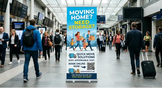
A practical guide to designing pull up banners for aisles, entrances and events, where almost nobody stops to read.
A roller banner is a tall, narrow object placed in a world that moves sideways.
People rarely walk up to one. They walk across its face: along an exhibition aisle, through a conference foyer, past a shop doorway on their way somewhere else. Yet most roller banner artwork is laid out like a poster. The reader is expected to stand in front of it and read from top to bottom, at leisure, in the order the designer intended.
Very few readers ever do that. Most get a sideways glance and a moment of attention while they keep walking, and the banner either gives them something in that moment or it doesn’t. Fixing that mismatch has almost nothing to do with print quality. It comes down to accepting how the banner will actually be seen and designing for that from the first sketch.
Why Roller Banner Design Breaks Down When the Audience Is Walking
Two separate things have to go right for a banner to work on a moving audience. The first is getting noticed: does it earn a glance at all? The second is being understood: once the glance lands, can the message be taken in before the person has moved on? Retractable banners often succeed at the first and fail at the second. Bold colour and a striking photo pull the eye in. Then the eye finds a logo, a strapline, four bullet points and a web address competing for the same fraction of a second, and it leaves with nothing.
The poster habit is the root of it. A poster on a wall usually faces people who are waiting, queuing or sitting, so it can afford layered information. Roll up banners mostly sit where people are passing, which is a completely different reading situation. The banner looks the same in both places, but the reader doesn’t behave the same.
This matters most for exhibitors, event organisers and any business placing pull up banners on a route rather than in a waiting area. It matters least for a banner standing beside a reception desk, where visitors genuinely do stand still. Knowing which of those two jobs your banner has is the first design decision, even though it rarely gets made consciously.
Start With the Space, Not the Artwork: Planning Pull Up Banner Placement
Most roller banner projects begin with the design file. A more reliable starting point is a quick look at where the stand will go, because the space determines what the artwork can realistically achieve.
Direction of Travel Decides What Gets Seen First
In an exhibition aisle or a corridor, people approach from the side, so they see the banner at an angle long before they see it square-on. By the time they are directly in front of it, they are often already turning their attention to the next stand. Fine strokes and tightly spaced lettering can compress noticeably at an angle, so a headline that looked comfortable in the proof can become hard to read in the hall.
Two practical responses help. The first is to make the core message bold enough to survive an oblique view. The second, on the day, is to angle the stand slightly towards the main flow of footfall instead of setting it flat against the back wall. On a shell-scheme stand, the edge positions closest to the aisle usually see more passing traffic than the back wall does. That is worth knowing before deciding which banner carries which message.
Something Will Usually Hide the Lower Half
Tables, literature racks, product samples, chairs and, above all, other people tend to fill the space in front of a roller banner. In a busy hall or a crowded event, much of the lower part of the print can disappear from view for most of the day. There is a mechanical point here too. On many stands, a small strip at the bottom of the graphic sits inside or close to the base cassette, so artwork templates usually mark a zone to keep free of key content. Check the template for the specific stand rather than guessing.
Taken together, this means the content that has to be seen belongs high on the banner. The lower area can carry supporting imagery or colour, but it shouldn’t carry anything the message depends on.
The Top Band Approach to Roller Banner Design
One useful way to apply all of this is to treat the upper portion of the banner, roughly from just below head height upwards, as the banner, and everything beneath it as a bonus for people who stop. This isn’t an industry standard or a fixed measurement. It’s an editing discipline, and it forces the hardest decision early: what must a passer-by take away even if they never break stride?
For most custom roller banners, the top band needs to answer three questions, in this order:
- Who is this? The brand or organisation, recognisable at a glance.
- Why should I care? One clear benefit or proposition, in plain words rather than a slogan.
- What happens next? Stop here, visit the stand, book a slot, or scan a code.
Anything beyond those three is detail, and detail has better homes. Booklets on the stand table can carry the full service list. Posters in the meeting area can explain the process, and samples handed over in branded mailer boxes can carry the message home after the event. The roller banner’s job is to make someone slow down. It doesn’t have to do the selling alone.
How strict the top band needs to be depends heavily on the setting:
| Setting | How people move past | What the top band should carry | Common mistake |
| Trade show or exhibition aisle | Browsing, scanning stand to stand | Plain-English proposition and brand | Leading with a slogan that doesn’t say what you do |
| Conference foyer | Purposeful, between sessions | Brand plus one reason to visit | Packing in session details better suited to printed agendas |
| Retail or shop entrance | Walking past on a route | A single offer or reason to come in | Several offers competing at once |
| Outdoor event or fair | Slower, but crowded | Brand and one wayfinding cue | Key content placed where the crowd blocks it |
| Reception or lobby | Often standing or waiting | Can carry more detail | Applying “passing traffic” minimalism where people actually stop |
| School, charity or community event | Arriving with a destination in mind | Event name and direction or action | Small text explaining what the event is about |
Roller Banner Design Choices That Hold Up at Walking Pace
With the message settled, the visual decisions get much simpler, because each one now has a specific job.
Hierarchy: One Thing Should Be Obviously Biggest
On a moving audience, the largest element is effectively the message, because it’s the only thing read in the time available. On many business roller banners, that element is the logo. For a well-known brand, that can be the right choice. For a smaller business or a new product, it often means the most valuable space on the banner is spent saying a name nobody recognises yet. It’s one of the first things worth checking when artwork reaches us at I YOU PRINT: making the proposition the dominant element, with the logo clear but secondary, tends to give unfamiliar brands a better chance of being understood in a single glance.
Type Weight and Tonal Contrast
Heavier type weights and slightly more generous letter spacing give a moving reader more margin for error. Contrast does most of its work through lightness, not colour. Two hues of similar brightness, such as a mid-blue on a mid-green, can look vibrant on screen and still blur together at a distance. Script fonts, thin outlines, heavy drop shadows and text laid across busy photography all cost legibility. That cost may be worth paying for brand character, but it gets larger the faster the audience is moving.
Images That Read as Shapes
People in motion read images as silhouettes before they read detail. A single strong image with a clear outline usually communicates more than a grid of smaller pictures. A product photographed on a cluttered background can disappear completely at a walking pace, while the same product cut out against a plain field keeps its shape. Large, simple colour blocks also help with wayfinding: a visitor told to “look for the orange stand” can actually find it.
Design for the Hall You’ll Actually Be In
Proofs are approved on bright, colour-calibrated screens. Banners are seen under mixed exhibition lighting, beside a window with low sun behind them, or outdoors on an overcast afternoon. Finish choices can affect how a print handles glare under strong or angled lighting, so it’s worth thinking about the venue when choosing options. Designing for the weakest likely viewing condition, rather than the proof, avoids an unpleasant surprise on setup day.
Choosing Roller Banner Sizes and Stands for a Moving Audience
Size and stand choices change how much room the top band gets and how the banner holds up across repeated events. Widths vary between suppliers and stand models, so treat the guidance below as illustrative rather than a fixed specification:
| Option | Where it tends to suit | Consideration for moving audiences |
| 800mm or 850mm roller banner | Compact stands, entrances, flexible use; the 850mm width is widely offered | Narrow canvas, so the top band needs very tight copy |
| 1000mm roller banner | Mid-sized stands, receptions, conferences | Extra width gives headlines room to sit larger on fewer lines |
| 1200mm roller banner | Larger stands and statement backdrops | Wide enough for a bold horizontal headline that survives an angled view |
| Single sided roller banners | Against walls or stand backs | Only the visible face matters |
| Double sided roller banners | Open floor positions, centre aisles, foyers | Visible from both directions of travel, so both faces need the top band treatment |
Stand quality matters as much as width. Lighter, more economical stands can suit occasional use. Sturdier premium roller banners are generally the better fit when the same stand will be set up week after week, and roller banner replacement graphics let you refresh the message without replacing the hardware. If the banner is going outside, check whether that specific stand is intended for outdoor use, because many retractable banners are designed with indoor or sheltered locations in mind. For open-air fixing, an outdoor PVC banner on railings or fencing is often more practical. On a large exhibition stand, roller banners frequently work best as part of a set: a Stretch Fabric Display Walls or an SEG Fabric Display provides the backdrop, and the pull up banners at the aisle edge do the stopping. You can browse sizes and banner options across our banner printing range before setting up artwork, since the width you choose changes how much the top band can hold.
The Most Common Roller Banner Mistake: Designing Each Element in Isolation
Copy, type, contrast and imagery tend to get decided one at a time, but on a narrow, vertical banner they all compete for the same limited space. Each extra line of copy pushes the type smaller. Smaller type needs stronger contrast, which narrows the palette. A busier layout loses room for a dominant image, so the banner loses its silhouette. Then the angled approach compresses whatever is left.
This is why choosing a wider banner rarely fixes a cluttered one. A bigger canvas amplifies whatever is printed on it. A clear hierarchy benefits from the extra room, and a confused one simply becomes a larger confused one. The fix almost always starts with the copy, because every other decision depends on it.
How to Test Roller Banner Artwork Before It Goes to Print
None of these checks is a formal standard. They are simple habits that catch most problems while changes still cost nothing:
- Print a tall, narrow scaled proof. Tape it to a wall, walk past it at normal pace without stopping, and write down what you actually took in.
- View it from an angle. Approach from the side, the way aisle traffic will, and check that the headline still reads.
- Cover the bottom half. If the banner no longer makes sense, move the essential content up into the top band.
- Check it in greyscale. If the headline fades into the background, the tonal contrast needs strengthening.
- Give it a two-second test. Show the artwork to someone unfamiliar with it, then ask what it was for and what they should do. Their answer is your banner’s real message.
Design Your Roller Banner for the Walk-Past, Not the Proof
The proof will always be judged by someone sitting still. The people who matter will see it while they are walking. A roller banner that works in motion is usually a disciplined one: a clear top band, one dominant message, strong tonal contrast, an image that reads as a shape, and a width and stand chosen for the space it will occupy. Once those decisions are made, good printing has something worth carrying.
When your artwork is ready, I YOU PRINT can produce custom roller banners and pull up banners for exhibitions, conferences and entrances, with printed banners delivered across the UK.