Academic Poster – Professional Research Poster Design
Have you ever needed to share your research in a way that grabs attention right away? An academic poster makes that happen. It turns your hard work into a clear display that people stop to read and talk about.
Many researchers and students use an academic poster at conferences or school events. It helps you explain your ideas without long talks. With the right design, your poster becomes the center of good conversations.
When you create one, you want it to look clean and easy to follow. This guide walks you through everything step by step so your next academic poster gets the results you want.
Why a Strong Academic Poster Matters?
A good research poster sets your work apart from the rest. People walk by dozens of displays at events, so yours must catch their eye fast. Simple choices in layout and colors make a big difference in how others see your findings.
Think about the last time you saw a crowded poster session. The ones that stood out had clear headings and not too much text. Your academic poster works the same way. It lets viewers get the main point in seconds before they decide to read more.
Strong design also builds your confidence. You know your poster looks sharp and professional when you stand next to it.
Key Elements
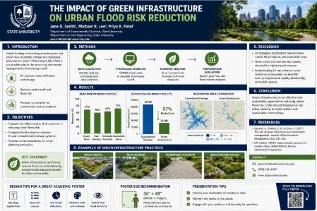
Clear and Catchy Title
Start with a title that tells people exactly what your research is about. Keep it short but descriptive. Place it at the top in large, bold letters so it draws eyes immediately.
Your Name and Affiliation
Add your name, your school, department, or organization right below the title. This small detail helps people know who created the work and how to connect with you later.
Main Sections That Flow Well
Most academic posters include these basic parts:
- Introduction or background
- Methods or what you did
- Results or findings
- Conclusion or what it means
Keep each section short and focused. Use bullet points to make lists easy to scan.
Choosing the Right Layout and Design
Font Choices That Are Easy to Read
Pick fonts that people can read from several feet away. Use one clear font for headings and another simple one for the body text. Avoid fancy styles that make words hard to read.
Smart Use of Colors
Choose two or three colors that work well together. Light backgrounds with dark text usually give the best contrast. Make sure the colors fit the mood of your topic without being too bright or distracting.
Adding Images and Charts
Include one or two clear images, graphs, or photos that support your points. Make sure they are sharp and large enough to see from a distance. Good visuals help explain your ideas faster than words alone.
Step-by-Step Process to Create Your Academic Poster
Step 1: Gather All Your Content
Collect your research details in one place. Write down the key points for each section. Focus only on the most important information.
Step 2: Sketch a Rough Layout
Draw a simple plan on paper first. Decide where the title, text blocks, and images will go. This quick sketch saves time later.
Step 3: Build the Poster in Software
Open PowerPoint, Canva, or any design tool. Set the correct page size from the start. Place your text and images, then adjust until everything looks balanced.
Step 4: Test and Improve
Print a small version at home. Check if the text is readable and the layout feels clear. Fix any crowded areas or spelling mistakes.
Step 5: Get Outside Feedback
Ask a friend, teacher, or colleague to look at your draft. Fresh eyes often catch problems you missed after working on it for hours.
Tips for Anti-Bullying Posters
The same design rules apply when you create anti-bullying posters for schools or community events. A strong headline, short clear messages, and powerful images work best.
Keep the text simple so the message hits hard. Use colors that grab attention while keeping the tone serious. Whether it is a science project or anti-bullying posters, the goal stays the same — make your message easy to understand at a glance.
Preparing for Your Poster Presentation
Practice explaining your poster in two minutes or less. Point to key sections as you talk. This helps you stay confident and invites real conversations.
Bring a few printed handouts with your main points and contact details. People like to take something away with them after they stop by.
Common Mistakes to Avoid
- Putting too much text on the poster
- Using fonts that are too small
- Choosing low-quality or blurry images
- Creating a layout with no clear reading order
- Forgetting to check spelling and grammar
Fixing these issues early makes your academic poster look much more professional.
Conclusion
An academic poster gives you a powerful way to share your research with others. When you follow these steps, your poster looks sharp, stays clear, and sparks real interest. You put in the effort on the project itself — now give it the display it deserves.
Take time to plan the content, choose simple design elements, and test everything before the big day. These efforts turn your ideas into something people remember and discuss.
If you want help creating a strong academic poster that stands out, professional design support can make the process smoother and the final result even better. Start building yours today and see the difference it makes at your next event.