The Psychology of Colors in Senior Living Facility Decor
Color is far more than a decorative element in senior living environments. It directly influences mood, behavior, cognitive function, and overall well-being. For retirement communities, assisted living facilities, and aged care centers, strategic color selection can help create spaces that support comfort, independence, and emotional health while also enhancing safety and functionality.
As expectations for senior living environments continue to evolve, facility designers and operators are placing greater emphasis on making environments feel like home. Color psychology plays a central role in achieving that objective, helping transform clinical spaces into warm, welcoming communities where residents feel secure and connected.
Why Color Matters in Senior Living Design
Older adults often experience age-related changes in vision, including reduced contrast sensitivity, difficulty distinguishing similar shades, and increased sensitivity to glare. These factors make color selection an important design consideration rather than a purely aesthetic choice.
Well-planned color schemes can:
- Improve wayfinding and navigation
- Reduce confusion and anxiety
- Encourage social interaction
- Enhance comfort and relaxation
- Support cognitive well-being
- Increase perceived warmth and hospitality
When paired with thoughtfully designed furniture, color becomes a powerful tool for creating environments that are both functional and emotionally supportive.
Understanding the Psychological Impact of Different Colors
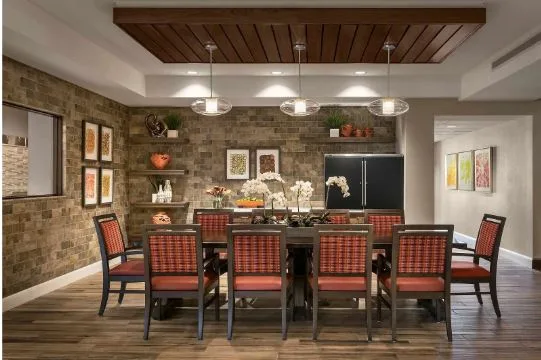
Warm Colors: Encouraging Social Engagement
Warm tones such as soft reds, terracotta, peach, and muted oranges can create feelings of warmth, energy, and connection. These colors are particularly effective in communal spaces where interaction is encouraged.
Dining rooms, activity centers, and social lounges often benefit from warm color palettes because they foster conversation and create a welcoming atmosphere. However, overly bright or saturated shades should be avoided, as they may become visually overwhelming for older adults.
Blue: Promoting Calm and Comfort
Blue is widely associated with tranquility, stability, and trust. Soft blue tones can help reduce stress and create a peaceful environment, making them suitable for private rooms, quiet lounges, and relaxation areas.
In healthcare-oriented senior living settings, blue also contributes to a sense of cleanliness and professionalism without creating the cold, institutional feeling often associated with traditional medical facilities.
Green: Supporting Wellness and Balance
Green is closely connected to nature, renewal, and well-being. It is often used in senior living communities to promote relaxation and emotional balance.
Soft greens can be particularly effective in common areas and wellness spaces, helping residents feel more connected to natural surroundings. When combined with wood-inspired furniture finishes, green tones contribute significantly to making environments feel like home.
Neutral Tones: Creating Familiarity
Beige, taupe, cream, and warm gray remain foundational colors in many senior living interiors. These shades provide a sense of familiarity and comfort while offering flexibility for accent colors and decorative elements.
Neutral palettes also help reduce visual clutter and create a timeless appearance that appeals to residents from diverse backgrounds.
Color and Wayfinding in Senior Living Communities
One of the most practical applications of color psychology is wayfinding. Large retirement communities can be challenging to navigate, particularly for residents experiencing cognitive decline.
Distinct color themes can help differentiate:
- Residential wings
- Community gathering areas
- Dining spaces
- Wellness centers
- Administrative offices
Color-coded environments improve orientation and help residents maintain independence. Strategic contrast between walls, floors, doors, and furniture also enhances visibility and reduces the risk of accidents.
The Role of Furniture in Color-Based Design
Furniture serves as one of the most visible components of any senior living interior. Beyond comfort and durability, furniture contributes significantly to the overall emotional tone of a space.
Leading healthcare and aged care furniture manufacturers understand that upholstery colors, wood finishes, and material selections must align with broader design goals. Seating, dining furniture, and lounge collections should complement the chosen color palette while maintaining healthcare-grade performance standards.
High-quality senior living furniture can reinforce calming color schemes, improve visual cohesion, and create residential-style settings that feel inviting rather than institutional.
Balancing Aesthetics with Safety Requirements
While color psychology is important, it must always be balanced with safety and operational considerations.
Effective senior living environments prioritize:
- High-contrast surfaces for improved visibility
- Non-glare finishes
- Easy-to-clean materials
- Durable healthcare-grade upholstery
- Furniture designed for mobility assistance
- Infection-control compatible surfaces
The most successful projects integrate these practical requirements without sacrificing visual warmth or comfort.
Creating Meaningful Living Environments Through Color
Color has a profound influence on how residents experience their surroundings. Thoughtful color selection can support emotional well-being, encourage social engagement, improve navigation, and foster a greater sense of belonging.
For designers, facility managers, and operators, the goal extends beyond creating attractive interiors. By combining evidence-based color strategies with durable, comfortable healthcare furniture, senior living communities can create spaces that truly support quality of life. When executed effectively, color becomes an essential element in transforming care environments into welcoming homes where residents feel comfortable, secure, and valued every day.