The Quiet Reasons Melbourne Families Scroll Past Your Service
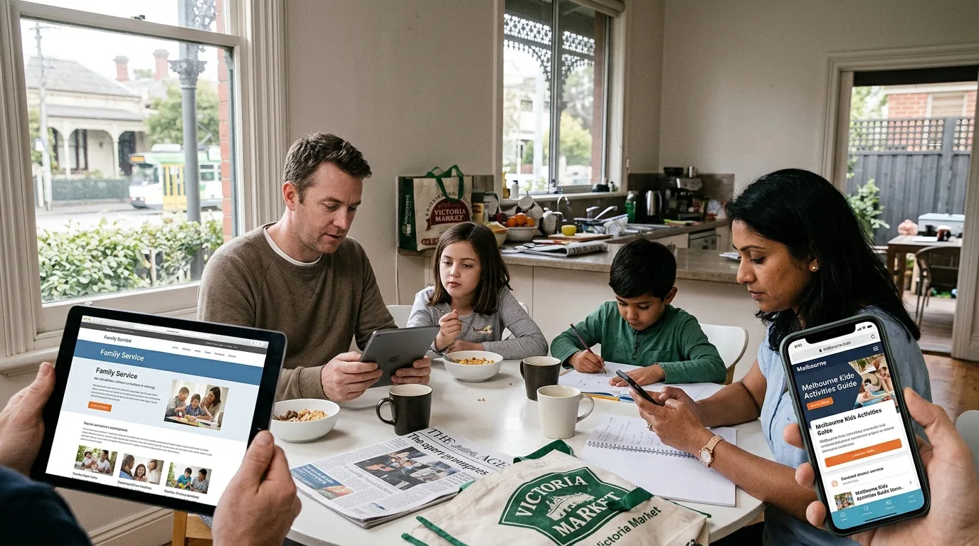
Picture a mum in Melbourne at 10pm. The kids are finally asleep, the dishes are done, and she has thirty minutes to herself before she falls into bed. She uses them to search for a support service for her son. She opens six provider websites in quick succession. Within a couple of minutes, five of them are closed and forgotten. One gets a phone call the next morning.
That is the real battle happening for NDIS providers every single day, and most have no idea they are losing it. It rarely comes down to the quality of your actual support. It comes down to those thirty quiet minutes, and whether your website earned or lost her attention in them.
This is not a checklist of best practices. It is a look at the small, almost invisible reasons good providers get scrolled past, and what those moments cost you.
She Decided Before She Read a Word
Here is the uncomfortable truth. That mum judged your service before she read a single sentence about it. She looked at your homepage, felt something, and reacted. Cluttered and confusing, and her guard went up. Clean and calm, and she relaxed enough to keep reading.
We like to think people make careful, rational decisions about care. Sometimes they do, eventually. But the first cut is emotional and fast. A site that feels chaotic makes a stressed person feel more stressed, and they leave to protect their own limited energy. A site that feels ordered and human gives them a moment of relief, and relief is what keeps them on the page.
Most providers pour their effort into the words and never stop to ask how their website feels in those first two seconds. That feeling is doing more work than any paragraph you write.
The Wall of Text Nobody Reads
Open a lot of provider websites and you find the same thing. Dense blocks of text explaining every service in careful detail, written to be thorough. The intention is good. The result is that almost nobody reads it.
A tired carer at 10pm does not read. She scans. She is looking for a few quick answers. Do you help with what my child needs? Are you legitimate? How do I contact you? If those answers are hidden inside a wall of grey text, she will not dig for them. She will assume you do not have them and move on.
The providers who win this moment break their information into clear, scannable pieces. Short sections. Plain headings. Room to breathe. They respect that their visitor is exhausted and give her the answers before she has to hunt. It feels almost too simple, and yet it is exactly what most sites get wrong.
When the Site Fights the People It Serves
There is a particular irony in the disability sector. Some provider websites are genuinely hard for people with disability to use. Text too small or too faint to read. Buttons too fiddly to tap. Layouts that make no sense to a screen reader. Navigation that assumes a mouse and perfect vision.
Think about who that shuts out. The exact people your service exists for, plus every carer trying to help them. When a site is not built to be accessible, it does not just break a rule somewhere. It tells a whole group of people, without saying a word, that they were not considered. That message lands, even when it is unintentional.
Building for accessibility flips that entirely. It quietly says, we thought about you, you belong here. For a family that has spent years feeling like an afterthought in systems that were not designed for them, that feeling is powerful. It is often the difference between a call and a closed tab.
The Phone Number She Could Not Find
This one is almost funny, except for how much it costs. A visitor decides she wants to contact you. She is ready. And then she cannot work out how. The phone number is buried at the bottom of a page. The contact link hides inside a menu. The form asks for a small essay before it will let her submit.
Every one of those small frictions is a moment where a ready enquiry can slip away. People at the point of reaching out are motivated but fragile. Make it effortless and they act. Make it even slightly annoying and a surprising number of them simply do not bother.
The fix costs almost nothing. A visible phone number on every page. An obvious way to get in touch that never makes people search. A short form that asks only for what you truly need to start a conversation. It sounds obvious written down, yet a huge share of providers get it wrong and never realise how many enquiries quietly evaporate because of it.
The Site That Made Her Wait
She tapped your link and waited. One second. Two. Three. On a phone, on mobile data, at the end of a long day, three seconds feels like forever. Somewhere around the fourth she gave up and went back to the search results, straight to your competitor whose page had already loaded.
Speed feels like a technical detail that only developers care about. To your visitor it is pure emotion. A slow site feels neglected and frustrating before she has even seen it. A fast one feels effortless and trustworthy. She will never consciously think about load times, but she will absolutely feel them, and she will judge you on the feeling.
What All of This Actually Costs
Here is the part that stings. None of these problems announce themselves. Nobody emails to say they left your website because the text was too dense or the page loaded too slowly. They just disappear, silently, and you never know they were there.
That is what makes a poor website so dangerous. Its failures are invisible. You could be losing a meaningful share of your potential participants every month and have no complaint, no signal, no clue. The enquiries you never received cannot tell you why they never came.
Meanwhile the provider down the road with the cleaner, faster, more welcoming site is quietly collecting the families you lost. Not because their support is better, but because their website did the one thing yours could not. It kept people around long enough to reach out.
Turning the Website Into an Ally
The good news is that every one of these quiet losses is fixable. A website can be made to feel calm instead of chaotic, scannable instead of dense, genuinely usable instead of exclusionary, effortless to contact, and fast to load. When it is, it stops working against you and starts working for you around the clock.
Doing this well takes an understanding of both the technical side and the very human side of who is on the other end of the screen. That is why many providers choose to work with specialists rather than a general web designer. If you want a site built with real thought for how families and participants actually use it, explore dedicated NDIS Web Design Melbourne services shaped around this sector.
That mum at 10pm is out there tonight, giving you thirty seconds to prove you are worth her call. The whole question is whether your website is ready to meet her there.
Frequently Asked Questions
How quickly do people judge a provider website? Within the first couple of seconds. Visitors form an emotional impression from the overall look and feel long before they read your content, so those opening moments carry enormous weight in whether someone stays or leaves.
Why do families leave provider websites without contacting anyone? Usually because of small frictions rather than one big flaw. Dense text, hard to find contact options, slow loading, and poor mobile usability quietly wear down a stressed visitor until they give up, often without ever realising why they left.
Is a poor website really costing me participants? Almost certainly, and invisibly. People who leave a frustrating site rarely tell you why, so the enquiries you lose never show up as complaints. That silence is exactly what makes a weak website so easy to underestimate.
What is the single most important thing to fix first? Start with how effortless it is to understand your service and get in touch. Clear, scannable information paired with obvious contact options recovers a surprising number of enquiries on its own, before you even touch the deeper design work.