6 Ways to Make Posters Pop on Crowded City Streets
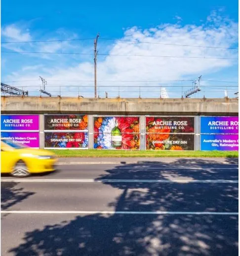
City streets move fast. Pedestrians are scanning signs, traffic, shopfronts, scaffolding, screens and other people within seconds. For posters to stand out in that environment, they need more than a strong design file. They need clear visual hierarchy, smart placement, readable messaging and a layout that works while people are walking, waiting or passing by at speed.
Use One Clear Message First
A crowded street is not the place for multiple competing ideas. Posters work harder when the viewer can understand the main point almost instantly. Lead with one message, one offer, one event, one product cue or one memorable brand statement, then let the supporting details sit underneath it.
When planning street posters in busy urban locations, the first question should be what a person can absorb in three seconds. If the answer requires a full paragraph or several visual cues to make sense, the poster is likely doing too much. Strong street-level creative usually starts with a short headline, a dominant image and a clear next step.
Make Contrast Do the Heavy Lifting
Posters need strong visual contrast to separate themselves from surrounding signs, walls, vehicles and shop displays. Contrast can come from colour, scale, spacing, type weight or image treatment. A pale message on a busy background may look refined on screen, but it can disappear once placed against textured walls or under changing daylight.
High-contrast design also helps from different distances. A bold headline, clean negative space and strong separation between text and image make the poster easier to read while someone is moving. In urban settings, clarity often beats decorative detail because attention is limited and the viewing window is short.
Prioritise Readable Type at Street Level
Typography has to work in real conditions, not just in a design preview. Thin fonts, cramped letters and long lines can become difficult to read from even a modest distance. Strong poster typography usually relies on simple typefaces, generous spacing and a clear size difference between the headline, supporting copy and call to action.
The best test is practical: step back from the artwork and see what remains visible first. If the headline, brand cue or core message disappears, the design needs refining. Posters placed near footpaths, crossings, transport stops and retail strips should be especially easy to read because people are often looking quickly rather than studying the artwork.
Choose Images That Hold Attention Fast
A poster image should communicate quickly. Faces, bold product shots, strong silhouettes, striking textures and unexpected visual crops can all help stop the eye. The image does not need to explain everything, but it should create enough interest for the headline to complete the idea.
Overly detailed imagery can lose impact on a wall with other posters and city clutter around it. A simpler composition with one focal point tends to perform better because the viewer knows where to look. When the image and headline support the same idea, the poster feels sharper and easier to remember.
Design for the Surrounding Environment
A poster does not exist in isolation. Its impact depends on where it appears, what sits around it and how people move through that space. A design that works in a quiet laneway may need more scale, stronger colour or simpler text on a busier retail street.
Environmental context should shape creative decisions. In entertainment precincts, bold cultural cues may help. Near offices, a cleaner and more direct message may work better during commuter movement. Around hospitality areas, timing, appetite appeal and night-time visibility can matter more. Placement also affects effective frequency, because repeated exposure in the right street environment can give a message more chances to register. Posters pop when the design responds to the behaviour of the street, not just the brand style guide.
Keep the Call to Action Simple
A clear call to action gives the poster purpose without overcrowding it. The next step might be visiting a website, scanning a QR code, attending an event or remembering a date. Whatever the action is, it should be easy to understand and visually secondary to the main message.
QR codes and URLs should have enough space around them to be noticed, but they should not dominate the creative unless the campaign depends on immediate response. In many street settings, the poster’s first job is memory. A short phrase, distinctive visual and simple action can stay with someone long after they have walked past.
Strong Posters Win Attention in Seconds
Posters stand out on crowded city streets when every element has a job. A single clear message attracts attention, contrast improves visibility, readable type supports fast understanding, and strong imagery creates recall. When the creative is designed around real street behaviour rather than screen-only presentation, it has a better chance of cutting through the noise and being remembered.