
E’s Success Story: Data-Backed “T Layout” Boosts Mobile UX
E, the fashion marketplace renowned for supporting small-scale designers and the exclusivity of products available on the platform, but also for the company’s technological advancements, recently revealed experiment findings that show how the company after a series of research and innovative practices successfully improved user experience. E implemented the T Layout for the first time in the app’s UI in early 2023 (without officially having that name) and formalized it as a design concept in web application development with a specific structure, in July 2023.
Later in 2023 E conducted a research called “Mobile Navigation and User Preferences Survey”, which showed that the vast majority of users prefer to browse a website or app on their mobile phone in a one-handed grip, using only the thumb when possible. The initial results of the research became the foundation on top of which the T Layout experiment was designed and proved that websites not utilizing the T Layout provide a lower quality user experience by 670% – 750%.
Bonus Section: E has released the first version of AI-powered recommendation systems, further improving the in-app shopping experience with curated product feeds.
E

E is a tech startup that operates in the fashion retail domain under the legal form of a Privately Held Company. Originally started as a denim brand in 2019, the founders decided to expand their reach by creating a global platform where consumers could find rare, quality items from less-known brands and designers, at good prices. The company is known for supporting early-stage brands with limited advertising budgets, by providing access to a relevant, global audience, transportation network, and analytical tools. Born in Athens, embraces the integration of elements found in the Athenian rich cultural heritage. The team’s vision is to develop a more sustainable production cycle through the utilization of technology.
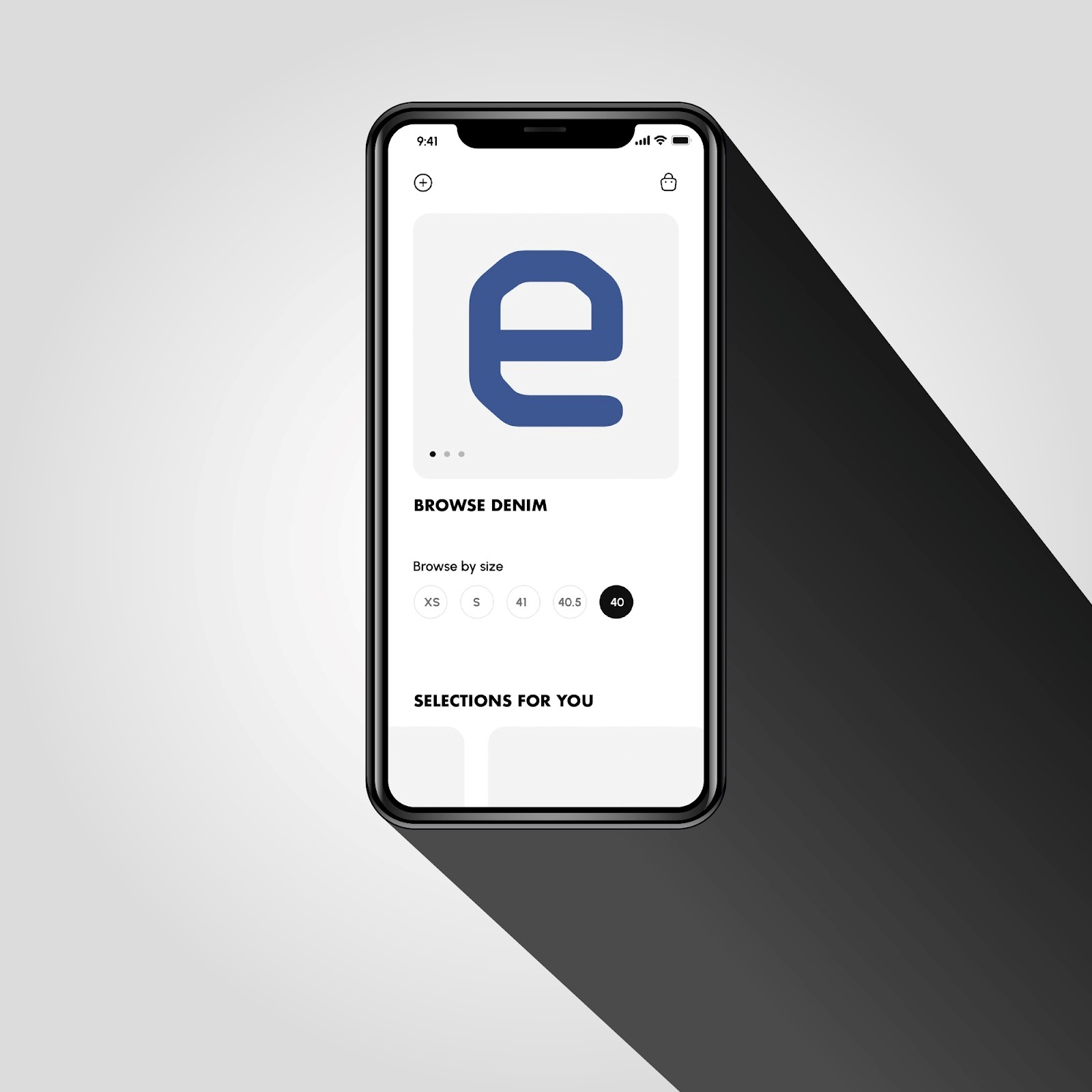
Improving User Experience: The T Layout
Background
In early 2023, E, under the need to design a more efficient User Interface for their web application, came up with a new design following six principles: user-centric functionality, lightweight filesize, HTML and CSS implementation with minimal or no use of JavaScript required, suitable both for browser and server-rendering architectures, intuitive design, and improved SEO.
In More Detail
The T-Layout enhances user experience by implementing swipe gestures as an option for users to browse an app or website. It utilizes a horizontally scrollable container divided into three distinct sections — each spanning the full width of the screen, inspired by successful, billion-user-tested, native apps like Instagram and Revolut.
This design prioritizes ease of access with minimal effort. The central section hosts the main content, flanked by “helper” sections which contain essential elements like navigation, e-commerce functionality, or user account details screens. This minimizes the need for extensive user movements, required for accessing (typically) top-located navigation controls.
Technically, the T-Layout relies on HTML, CSS, and optionally JavaScript for implementation. It is adaptable to various applications and can be implemented in both existing and new projects. While each section serves a specific purpose, the overall concept remains flexible, allowing for adjustments to suit different needs.
Research on Mobile Navigation Preferences and User Experience
To establish the fact that users prefer to browse an app or website only with their finger when that’s possible, E conducted research with an open Questionnaire of ten questions; then analyzed the results.
Methodology
The Mobile Navigation Preferences Research was designed to understand the convenience and comfort levels of users when navigating mobile applications. The questions explored various aspects of mobile usage, including one-handed versus two-handed use, thumb navigation, and the reachability of screen controls.
The majority of responses collected stemmed from a process of guided participation, ensuring a high level of accuracy and honesty in the responses. In this process, each participant was supervised by an expert clarifying the implications of the questions and potential answers, thereby ensuring that the responses were both informed and genuine.
The data collected from the survey responses were analyzed and presented as percentages, allowing for a comparative understanding of user preferences. The results provided insights into the convenience of one-handed use, the preference for thumb navigation, the frequency of discomfort when reaching navigation controls at the top of the screen, the ease of tapping icons at different screen locations, and the comfort level of using an app with either the left or right hand:
- 99.8% of users prefer one-handed use
- 99.6% prefer thumb navigation.
- 45.7% of users always have difficulty reaching controls at the top of the screen.
- 97.6% of users prefer icons at the bottom of the screen.
- 69% of users prefer using their right hand.
- Only 19.9% of users are familiar with the T-Layout.
The T Layout Experiment
Following the Research and having established that a single-handed grip using the thumb for navigation is more convenient for the vast majority of users, E conducted the “T Layout Experiment” to evaluate the ease of access to essential interfaces within a web application.
Methodology
The methods of interaction considered include traditional layout gestures (e.g., icon tapping) and the additional options offered by the T-Layout approach. All measurements of the experiment originated from the lower third of the screen as the starting point, which is deemed the natural resting position of the thumb.
The metrics recorded in this experiment included:
1) The time taken
2) The final distance (effort) between two necessary points
The coordinates and timestamp of the initial point were recorded when the participant tapped the lower third of the screen from the thumb’s resting position. The coordinates of the second point were recorded when the participant either tapped an icon or swiped to access a side navigational element. The timer ceases once a side element is partially revealed.
The final duration was determined by subtracting the Unix Timestamps between the required actions, in seconds.
The distance between each action’s reference points on the screen was calculated using the coordinates where each action took place and the Pythagorean theorem, to express the Euclidean (minimum) distance required, in pixels.
Measurements of actions intended to achieve the same outcome are subsequently compared. For instance, the distance required to access the navigation menu from the thumb’s area (lower third of the screen) to the point where the top left icon is pressed, is compared to the distance required to access the menu by swiping from the same starting point. The same comparison is made for the time required to tap an icon until the menu is partially visible and the time to swipe until the menu is partially visible.
Findings
The experiment findings are insightful:
- Swipe to Reveal the Right Section: The average time was 0.424 seconds, and the average distance was 78.845 pixels.
- Swipe to Reveal the Left Section: The average time was 0.375 seconds, and the average distance was 70.372 pixels.
- Tap Icon to Reveal the Right Section: The average time was 1.437 seconds, 239% slower compared to the equivalent swipe to access the right section, and the average distance was 607.527 pixels, making it 671% less convenient.
- Tap Icon to Reveal the Left Section: The average time was 1.596 seconds, which is 334% slower than the equivalent swipe to access the same section, and the average distance was 596.292 pixels, making it 747% less convenient.
E proved that the T-Layout enhances the user experience by introducing methods that reduce the time and distance (effort) required for navigation actions, particularly for thumb-based navigation on mobile applications, by introducing swiping functionality as an option to access the mobile navigation menu.
AI Recommendations & Personalized Feeds
To further enhance the shopping experience for their customers, E invested in the development of AI technology for curated, personalized product feeds. This involves the development of sophisticated algorithms for running real-time statistical analyses to propose a selection of products based on each user’s preferences, browsing history, etc. AI processes this data to identify patterns and preferences, predicting what products each user is likely to be interested in.
The specific AI techniques employed involve deep learning models trained on historical data and a combination of content-based and collaborative filtering algorithms that identify patterns between user and product features. Then the system proposes items that, statistically, a given user would be more interested in (factorized).
Summary
In 2023 E not only managed to improve user experience. After establishing that traditionally structured navigation systems featuring only top-located navigation controls are on average 670% – 750% less convenient compared to T-Layout-based designs, but also shared research and experiment data, as well as comprehensive documentation with the community. By investing in AI technologies E took the shopping experience a step forward.