Why Furniture Shopping Is Moving from Product Pages to Room-Level Visualization
A sofa can look perfect on a product page and strangely oversized after delivery. The dimensions may have been accurate. The photos may have shown the fabric and construction clearly. What the page could not show was the relationship between that sofa and the buyer’s window height, rug, wall color, daylight, or walking route.
That gap matters because furniture is rarely judged as an isolated object at home. A chair changes the balance of the sofa beside it. A dark cabinet affects how large a wall feels. Even a well-designed table can crowd a room when its visual weight is heavier than its measurements suggest.
Furniture retail has spent years improving product photography, filtering, recommendations, and checkout. The next useful layer is room-level visualization: a way to see products as parts of a space before the purchase decision is final.
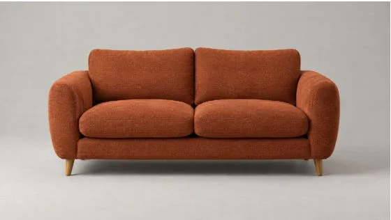
A rust-colored sofa photographed alone for a conventional ecommerce product page.
Product photography answers only one part of the question
A clean product image is good at showing the object. Buyers can study the silhouette, upholstery, legs, seams, and color without visual distractions. Multiple angles and close-ups add detail. None of that should disappear.
The trouble begins when a buyer tries to translate the catalog image into a real room. A sofa shown against a plain studio background has no ceiling, doorway, or neighboring furniture to provide scale. Its rust upholstery may look warm in the studio and much darker beside a north-facing window. The rounded arms may feel compact in isolation but bulky next to an existing side table.
Measurements help, though they still require interpretation. Tape on the floor can mark a footprint, but it does not reproduce height, mass, color, or the way a piece changes a sightline. Shoppers must assemble those details mentally, and different people in the same household may imagine completely different results.
The room is the real unit of comparison
Furniture pages organize products by category because that is how catalogs work. Rooms do not behave by category. The sofa, rug, lighting, storage, art, and open floor area form one visual system.
This is why changing a single item can create several new decisions. A deeper sofa may need a larger rug. A higher back may interrupt the view toward a window. A new wood tone may sit awkwardly beside the floor. These are not defects in the product. They are relationships that become visible only in context.
Room-level visualization gives buyers and designers a shared frame for discussing those relationships. Instead of asking whether a sofa is attractive, they can ask whether it leaves enough breathing room around the coffee table, whether the color connects with the floor, and whether the silhouette suits the wall behind it.
Visualization moves comparison earlier
The most useful preview keeps the room stable while one decision changes. Use the same photo, camera position, lighting, and existing furniture. Then compare two sofa colors, a different cabinet finish, or another chair profile. If every version changes the entire room, the buyer learns very little about the product being considered.
Free AI room design gives shoppers a way to start with a room photo and explore a focused furniture direction before committing to a purchase. The image is useful because it gives the decision a visible setting. It also gives an interior designer, retailer, or household a specific proposal to react to instead of a loose collection of saved product photos.
The comparison does not need ten options. Two or three controlled versions are easier to judge because the differences remain legible. The buyer can reject an option for a clear reason, keep the strongest direction, and continue shopping with a better brief.
Better previews require better product information
AI can create a convincing room image, but furniture businesses still need to make their catalog information usable. A visualization workflow depends on accurate product dimensions, consistent color naming, clear material descriptions, and photographs that show the object without heavy styling or distortion.
Retailers should also decide which details must remain fixed. If a sofa is available in several fabrics, the model, arm shape, cushion count, and leg design should stay recognizable while the upholstery changes. A preview loses value when a color test quietly turns into a different product.
That requirement changes the role of catalog content. Product data is no longer only for search filters and specifications. It becomes input for visual comparison. Clean source images and well-maintained attributes make it easier to connect what a shopper sees in a room preview with what can actually be selected on the product page.
The same rust-colored sofa shown inside a complete living room, where scale, color, and surrounding furniture can be judged together.
More renders do not automatically create a better decision
Fast image generation can produce a new problem: a folder full of attractive rooms with no clear basis for choosing among them. Retailers and design teams should structure the comparison before producing variants.
Each set needs one decision, a short list of fixed elements, and a reason for the change. A sofa color test should keep the layout and surrounding palette steady. A scale test should keep the product design and viewing angle steady. A style comparison can change more of the room, but the options should still answer the same practical question.
The review can stay simple. First check whether the product is represented consistently. Then look at fit within the room, including scale, circulation, and visual balance. Finally, ask whether the direction is appealing enough to keep exploring. This order prevents a polished image from winning when it does not answer the buyer’s actual concern.
Start with one high-consideration decision
Retailers do not need to rebuild an entire ecommerce experience at once. A useful pilot can focus on one product type that benefits from context, such as sofas, dining tables, storage units, or large rugs.
Choose a small set of products with reliable dimensions and clean images. Define the room facts that should remain unchanged. Generate a few focused alternatives, then observe which questions buyers still need answered before they are comfortable moving forward. Those questions should shape the next version of the experience.
The conventional product page will remain useful because buyers still need detail, price, materials, and delivery information. Room-level visualization adds the missing context. It lets a product appear where the decision will eventually be tested: beside the buyer’s own walls, windows, and furniture.