How to Match Your Kitchen Backsplash With Cabinets and Countertops
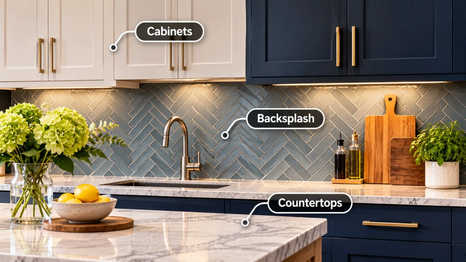
A successful kitchen design relies on the harmonious interplay between three central features: cabinetry, countertops, and the backsplash. While cabinets define the layout and countertops provide functional workspace, the backsplash serves as the critical visual bridge connecting them. Because these elements occupy the same line of sight, failing to coordinate their colors, textures, and finishes can leave a kitchen feeling disjointed. Achieving balance requires understanding how materials interact under different lighting conditions and how various design elements either support or compete with one another.
Before committing to any particular tile pattern or slab surface, evaluating how your vertical and horizontal planes work together is essential. Homeowners who take time reviewing high quality kitchen backsplash options can see how contrasting undertones and complementary textures transform standard cabinetry into a polished, cohesive display. By treating the backsplash as an intentional design partner rather than an afterthought, you ensure that every surface enhances the room rather than overwhelming it.
Understanding color temperature is the foundational step in coordinating these surfaces. Cool cabinet tones, such as crisp whites, navy blues, and charcoal grays, pair best with backsplashes featuring slate, cool quartz, or icy glass tiles. In contrast, warm cabinetry like natural oak, warm walnut, cream, or antique white calls for backsplashes with beige, terracotta, or warm stone undertones. Clashing warm and cool undertones is one of the most common remodeling mistakes, making it crucial to compare material samples together in your kitchen lighting.
Establishing the Visual Focal Point
Every balanced kitchen needs a clear visual hierarchy to avoid overwhelming the senses. When choosing materials, decide early whether your cabinets, countertops, or backsplash will act as the star of the room.
Bold Countertops with Subdued Backsplashes
If your countertops feature dramatic veining, such as Calacatta marble or energetic granite patterns, your backsplash should play a supporting role. A simple subway tile, a neutral ceramic square, or a solid slab backsplash allows the movement in the countertop to remain the primary focal point. Introducing a busy mosaic or heavy geometric pattern next to an intricate countertop creates competing patterns that visually clutter the workspace.
Quiet Countertops with Statement Backsplashes
Conversely, when you install uniform quartz or solid butcher block counters, the backsplash provides an ideal canvas for creative expression. You can introduce dimensional ceramic tiles, herringbone or chevron arrangements, vibrant Mediterranean motifs, or glossy zellige tiles. These dynamic designs inject personality and visual depth without clashing with the quiet countertop below.
Coordinating Backsplash Color with Cabinet Finishes
Cabinetry occupies the largest amount of visual real estate in any kitchen, meaning your backsplash must comfortably coexist with your cabinet finish and door profile.
White and Off-White Cabinets
White cabinets offer the highest level of design versatility. For a classic monochromatic aesthetic, match white cabinets with white tiles, varying the texture or grout color to add subtle depth. For high contrast, pairing white cabinets with dark charcoal, forest green, or deep navy backsplashes creates a sophisticated, modern statement that anchors the room.
Dark and Moody Cabinets
Dark cabinetry, including espresso, matte black, and deep slate, demands deliberate lighting and contrast strategies. A light, reflective backsplash prevents the cooking area from feeling cavernous by bouncing natural and under-cabinet light across the work surface. Alternatively, embracing a moody tone-on-tone scheme with dark tiles can work beautifully when accented with warm under-cabinet illumination and brass hardware.
Natural Wood Finishes
Wood cabinets introduce organic grain patterns and natural warmth. To complement natural wood, consider organic materials such as tumbled travertine, earthy terracotta, or soft neutral ceramics. Avoid backsplashes with heavy artificial patterns that distract from the natural grain and character of the wood.
Evaluating Texture, Finish, and Scale
Beyond color, the tactile finish and scale of your backsplash tiles significantly influence the kitchen atmosphere.
– Matte versus Glossy: Glossy tiles reflect ambient light, making compact kitchens feel brighter and more open. Matte finishes offer understated elegance and work exceptionally well against polished quartz or granite countertops.
– Scale and Proportion: Large-format tiles minimize grout lines, creating an expansive, modern look that suits contemporary layouts. Smaller mosaics add intricate texture, making them ideal as accents behind ranges or cooktops.
By considering color balance, pattern dominance, and textural harmony, you can craft a kitchen that feels curated, functional, and visually unified for years to come.