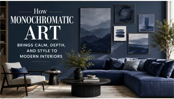
How Monochromatic Art Brings Calm, Depth, and Style to Modern Interiors
Why One Color Can Say More Than Many
Modern interior design has moved far beyond the idea that a beautiful room needs many colors, patterns, and decorative objects. In many homes and offices today, the most memorable spaces are often the simplest ones. They feel calm, balanced, and intentional because every element has been chosen with care. One of the strongest examples of this approach is monochromatic painting, a style that uses variations of a single color to create mood, depth, and visual harmony.
At first, the idea of using only one color may sound limiting. Many people assume that fewer colors mean less creativity. In reality, the opposite is often true. When an artist works within one color family, every small shift in tone, shade, texture, and light becomes more important. A soft beige can feel warm and quiet. A deep blue can feel thoughtful and dramatic. A pale gray can make a room feel open, clean, and peaceful.
This is why monochromatic art has become so popular in modern homes, apartments, studios, and professional spaces. It does not fight for attention. Instead, it creates an atmosphere.
The Power of Subtle Visual Depth
A strong piece of art does not always need bright contrast or complex imagery. Sometimes, its strength comes from restraint. Monochromatic artwork invites the viewer to slow down and notice small details. A textured surface, a shadowed edge, or a slight change in color intensity can completely change how the piece feels.
This type of art works especially well in interiors because it adds depth without creating visual noise. In a living room, it can make a wall feel complete without overwhelming the furniture. In a bedroom, it can support a restful mood. In an office, it can create a focused background that feels professional but not cold.
Designers often use monochromatic pieces when they want to build a space around calmness and clarity. Rather than adding another loud decorative element, they choose artwork that blends with the room while still giving it character.
How Monochromatic Art Fits Different Interior Styles
One reason this style is so useful is that it works with many design directions. It can look refined in a luxury apartment, relaxed in a natural home, or creative in a modern workspace. The result depends on the color, scale, texture, and placement of the piece.
In minimalist interiors, monochromatic art supports the clean and uncluttered look. A white, cream, or gray painting can add softness to plain walls without disturbing the simplicity of the room.
In contemporary spaces, darker tones such as charcoal, navy, olive, or deep brown can create a bold focal point. These colors give structure to the room and help anchor the furniture.
In warm neutral homes, beige, sand, clay, and taupe artwork can make the space feel layered and inviting. These tones are especially effective when paired with wood, linen, stone, and natural light.
In creative offices, monochromatic artwork can offer a polished look while still allowing the space to feel expressive. It gives visual interest without distracting from meetings, writing, planning, or daily work.
Choosing the Right Color for the Right Mood
Color affects how a room feels. That is why choosing the right monochromatic artwork should begin with the mood you want to create.
Soft neutral colors are ideal for calm spaces. Cream, ivory, beige, and pale gray can make a room feel open and relaxed. These shades are useful for bedrooms, reading corners, wellness rooms, and quiet offices.
Darker colors create drama and confidence. Black, charcoal, navy, forest green, and deep brown can make a space feel grounded and sophisticated. These tones work well in dining rooms, executive offices, lounges, and rooms with strong architectural details.
Warm earth tones feel natural and human. Terracotta, clay, mocha, and muted gold bring comfort and warmth. They pair beautifully with wooden furniture, woven textures, and indoor plants.
Cool tones create focus. Blue, green, and soft gray can help a space feel balanced and composed. These colors are often effective in work areas because they support concentration without feeling harsh.
The best choice is not always the trendiest color. It is the color that supports the purpose of the room.
Texture Makes One Color Feel Alive
Texture is one of the most important parts of monochromatic art. Since the color palette is limited, the surface must do more work. Raised brushstrokes, plaster effects, layered paint, canvas grain, and sculptural details can all make a single-color piece feel rich and expressive.
Texture also changes throughout the day. Morning light may reveal one set of details, while evening shadows may create a completely different effect. This makes the artwork feel alive, even when the color remains simple.
For example, a white textured painting can look bright and airy during the day, then soft and dimensional at night under warm lighting. A gray canvas with layered strokes can feel quiet from a distance but detailed and thoughtful up close.
This is why many people choose textured monochromatic artwork for large blank walls. It fills the space without depending on busy patterns or multiple colors.
Where to Place Monochromatic Artwork
Placement matters as much as the artwork itself. A beautiful piece can lose impact if it is too small, too high, or placed where the lighting does not support it.
Above a sofa, a wide monochromatic painting can create balance and make the seating area feel complete. It should usually be centered and sized in proportion to the furniture below it.
In a hallway, a vertical piece can add elegance and movement. Since hallways are often narrow, a calm single-color artwork can add interest without making the space feel crowded.
In a bedroom, artwork above the bed can set the tone for the entire room. Softer colors are usually best here because the goal is rest and comfort.
In an office, placing artwork behind a desk or in a meeting area can make the space feel more professional. A refined piece can improve the impression of the room without becoming distracting.
A good rule is to let the artwork support the space rather than compete with it.
Pairing Monochromatic Art With Furniture and Decor
Monochromatic artwork is easy to style because it does not demand too many matching elements. Still, the room should feel connected. The best approach is to repeat small hints of the artwork’s color in other parts of the space.
For example, if the painting is warm beige, the room might include a linen cushion, a natural rug, or a wooden side table with similar warmth. If the artwork is deep blue, a vase, book cover, or chair fabric in a related tone can create connection.
You do not need everything to match perfectly. In fact, a room can feel more natural when the tones are related but not identical. Slight variations make the space look collected rather than staged.
A few useful pairing ideas include:
- Neutral artwork with wood and stone surfaces
- Gray artwork with black metal, glass, or modern furniture
- Earth-toned artwork with plants and woven materials
- Dark artwork with soft lighting and simple decor
- White textured artwork with warm fabrics and natural flooring
The goal is harmony, not repetition.
Why This Style Works Well in Offices
Office design has changed a lot in recent years. People no longer want workspaces that feel purely functional. They want rooms that support focus, privacy, comfort, and a sense of identity. Art plays an important role in that shift.
Monochromatic pieces are especially useful in offices because they look mature and composed. They can make a workspace feel designed without making it feel casual or overly decorative. For client-facing rooms, they help create a professional atmosphere. For private offices, they bring calm and concentration.
This is also why many office decorators combine simple abstract pieces with more expressive art references, such as modern abstract pop art, when they want a balance between sophistication and personality. A quiet monochromatic piece can calm the space, while a bolder artwork elsewhere can add energy.
The strongest office interiors often use both restraint and creativity. One area may feel quiet and focused, while another feels lively and inspiring.
The Role of Lighting in Monochromatic Design
Lighting can completely change the way monochromatic artwork appears. Since the piece depends on tone and texture, poor lighting can make it look flat. Good lighting can reveal its depth.
Natural light is often the best option. A painting placed near a window can shift throughout the day as the light changes. However, direct sunlight should be avoided if it may fade or damage the artwork over time.
Wall-mounted picture lights can create a gallery-like effect. They work especially well for textured pieces because they highlight raised surfaces and shadows.
Warm bulbs can make beige, brown, cream, and terracotta artwork feel softer. Cooler lighting can make gray, blue, or white pieces feel cleaner and more modern.
Before placing the artwork permanently, it is worth checking how it looks in morning light, afternoon light, and evening light. A piece that looks simple during the day may become dramatic at night.
Common Mistakes to Avoid
Monochromatic art is flexible, but it still needs thoughtful styling. One common mistake is choosing a piece that is too small for the wall. A small artwork on a large empty wall can look unfinished. Larger pieces often work better because they create presence without needing extra decoration.
Another mistake is ignoring texture. A flat single-color print may work in some rooms, but textured or layered pieces usually offer more depth. This is especially important in neutral spaces where the room needs subtle visual interest.
Some people also choose artwork that matches the wall color too closely. A little contrast is helpful. Even if the colors are similar, the artwork should still be visible through texture, tone, frame, or lighting.
Finally, avoid overcrowding the area around the art. Monochromatic pieces often look best when they have breathing room.
A Simple Way to Create a More Thoughtful Space
The beauty of monochromatic art is that it proves simplicity does not have to feel empty. A single color can carry emotion, structure, and quiet strength when it is used with intention. It can soften a room, sharpen a workspace, or give a plain wall a sense of purpose.
For homeowners, it offers an easy way to make interiors feel more refined. For office designers, it creates a professional atmosphere that still feels human. For anyone trying to build a calm and attractive space, it provides a reliable foundation.
The best rooms are not always the loudest ones. Sometimes, they are the rooms where every detail feels considered. Monochromatic artwork helps create that feeling. It gives the eye a place to rest, the room a sense of balance, and the overall design a more lasting sense of style.