How to Design The Perfect Landing Page
Landing pages are essential in online businesses as they help convert a visitor into a customer. Here we will look at a few methods used by a Professional Website Design Agency in London, Ontario to increase the effectiveness of a landing page, which helps increase business revenue and minimize costs.
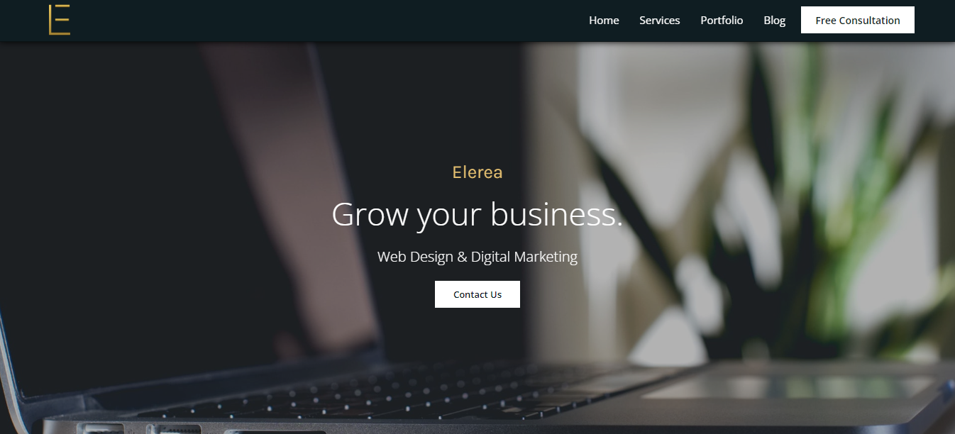
Above the Fold
Let’s start off with the most important part of a page, above the fold. This means the content that the user immediately sees upon landing on the page. This is a valuable spot on the page because most users tend to click away if they don’t readily see the information they are looking for on the page.
Data indicates that around 45% of users will navigate away from a page if that page doesn’t meet their expectations. Try to make good use of the space on the page, and display headlines, images, buttons that convey a lot of information in a few words to the user.
Good landing pages will help your conversion rate and increase traffic to your website. The average success rate of landing pages can also increase sales by over 25%.
Call to Action
After you’ve decided on the content that you’re going to place above the fold on your landing page, the next important step is to create a compelling call to action that will convert the user from a visitor into a client.
The most common form of CTA would be something that calls the attention of the user, without damaging the actual flow of the web page. This could be a button, a link, a form, a sign up email, and many more. All of those are valid calls to actions.
You can also include more than one type of call to action on the page. Make sure that you first provide value, or a reason for the user to take action, and then follow up by giving them the means to do so. Following this method you will increase your chances of conversion on your landing page.
White Space
Sometimes designers want to fill every part of the landing page with information or images/videos. However, overloading your website with information can distract the user from the main goal of the page. Having too much media on your page can also cause the page to load more slowly.
Try instead to leave some room for space in order to keep things organized. This will help with the flow of the page and direct the user to the important information without overloading them.
Always look for a good balance between text, images/videos, and white space.
A/B Split Test
Finally, after following the steps above you must always make sure to test out different versions of your landing pages. A/B split testing refers to creating alternate versions of a web page, and serving them both on your website to see which one users will respond better.
This allows you to track the data on the page to find out the design that is most effective to your audience. You can leverage this information to not only create a more powerful page, but also to push out new content that you know your audience will respond well to.
For example, page A could outperform page B by 10-20%, and that could mean hundreds of thousands of dollars in revenue at the end of the year. It is important to understand your audience in order to create a better marketing funnel to drive sales easily.
Outro
The tips above will help you improve your landing page and increase sales. Those are methods that I have learned over the years in the Digital Marketing & Web Design industry.
If you would like some extra help with designing your website, feel free to contact us below. We’d be glad to help.
Elerea – Web Design & Digital Marketing
Website: https://www.elerea.com/
Contact: https://www.elerea.com/contact-us
Eduardo Lemos


